Charlie Park http://charliepark.org 2015-06-28T00:00:00-07:00 Charlie Park Happy Pride 2015 /happy-pride-2015 2015-06-28T00:00:00-07:00 2015-06-28T00:00:00-07:00

I posted something here Friday that I’ve decided to take down. It was a kind-of-grumpy piece about corporations co-opting meaningful symbols, and my frustration with companies monetizing struggles for equality and justice.

I don’t disagree with the stuff I wrote, but it’s a topic better chatted about in person. Let’s do that sometime.

Anyway, you can still read the post via git logs. And there was a great Wendell Berry quote that I might repost some time.

But I’m just really happy about the Supreme Court’s ruling on gay marriage this weekend. It’s not a time to be mad.

Happy Pride!

The White House, lit with rainbow-colored lights, to celebrate the Supreme Court ruling recognizing gay marriage as legal everywhere in America.

Stepping Away From Twitter /stepping-away-from-twitter 2015-06-12T00:00:00-07:00 2015-06-12T00:00:00-07:00

I recently noticed an interesting pattern.

On days when I’m on Twitter, my ability to focus and get good work done falls off a cliff.

It’s not just “when you read Twitter first-thing in the day”, something I’ve heard people discuss. It was that I was on Twitter at all.

I think there are a few things going on with this.

First, I want to be liked. If I post something on Twitter, it’s pretty common for me to check back in on that tweet several times, hoping for someone to favorite or retweet it.

Second, I want to find interesting friends. If someone favorites or retweets my tweet, I usually click through to find out more about them. Or if I’m reading my feed and one of you retweets something from someone interesting, I often click through to find out more about your friends. Maybe they’ll be my friend, too!

Third, I want to stay in the loop. It’s incredibly easy to rationalize this: I need to stay on top of the latest technologies; I need to know what’s happening in different startups; I need to know about what’s going on in the wider world. In truth, though, the important things will still find their way to me, via channels other than Twitter.

Fourth, I want to be entertained. Much of the stuff that comes across my feed is interesting and funny. What? New trailer for The Martian? Great! A video of Amy Schumer being funny? Bring it! New XKCD strip? That’ll just take a second! And yet, it never does.

I took a break from Twitter for a few weeks earlier this year. It felt really good. I felt like I was getting more and better work done.

And then, really easily, I fell back into Twitter. It was natural. After all, who doesn’t want to be liked, have friends, and be informed and entertained?

But I noticed that my work suffered.

So I’ve taken a break again, this time for the rest of June. We’ll see how it goes.

Here’s hoping for more and better work getting done.

Make Breakfast SF /make-breakfast-sf 2015-03-31T00:00:00-07:00 2015-03-31T00:00:00-07:00

Side projects can be lonely, and you should have friends.

So I’m hosting a monthly meetup now for rad people with side projects. Make Breakfast SF.

The idea’s simple: You show up and get coffee (and breakfast, if you like), and work on your side projects alongside me and anyone else who shows up. It’s casual, so if you want to chat, that’s cool, too. We’re friendly.

We work for an hour or so, then go on to our jobs. It’s in the morning to make it easier for people with families to come.

Just to set expectations, it might be just you and me. Or maybe it’ll be a bunch of us. Who knows! We’ll have fun!

So. Make Breakfast SF is this Thursday (April 2nd), from 7:45 to ~8:45, at the Corner Bakery Cafe at 665 Market.

I’m off Twitter this week, so ping me at charlie@charliepark.org if you have questions.

Come! Side projects can be lonely, and you should have friends!

Ugh, Titles /ugh-titles 2015-03-20T00:00:00-07:00 2015-03-20T00:00:00-07:00

It apparently doesn’t take much friction to keep me from blogging.

And there’s lots of reasonable friction in my life. A job. A sizable (and very patient) sideproject. A sizable (and very patient) family. A commute.

And reasonable-ish friction: Twitter, blog posts I want to read, conference talks to pitch.

But I recently realized something that adds completely unnecessary friction to my blogging: The desire to come up with a clever title for my posts. Is it some misplaced hope that they’ll blow up, and a clever title will make me look more intelligent? Some lock-in on the archetype of what a blog is supposed to look like? A pattern I fell into back when I ran a newspaper and wrestled for hours with just the right title to hook readers? Not sure.

That was one of the nice things that Tumblr got right — titles weren’t necessary. Just type and publish. I don’t know that I’ll bother to rework my template for this site, but — as a note to future Charlie — don’t get hung up on things that aren’t truly necessary. And maybe even try swinging the pendulum in the other direction.

BART to SFO /bart-to-sfo 2015-03-19T00:00:00-07:00 2015-03-19T00:00:00-07:00

You do this, right?

When you’re waiting at a subway station, you think: “Where’s the escalator going to be at my arrival station?” And then you move to that spot in your departure station, so you have less distance to walk when you get to where you’re going. Right?

I fly out of SFO about five or six times a year. Frequent enough that I should know where the elevators and stairs are, but not so frequent that I’ve actually bothered to note where everything is. Coupled with the fact that there’s both the BART and the AirTrain to work with, and that I’m usually a little stressed about security / catching my flight / the work I haven’t finished / etc., it’s a little more complicated. I wanted to fix that, so here are my notes from the last time I flew out. Maybe they’ll help you, too, but these are mostly here for me.

  • Get on the BART, heading towards SFO. Feel free to wait until there’s an SFO train, but I tend to get on the first one heading in the right direction and then get off at Balboa Park or San Bruno. (My general rule growing up in DC was: You don’t know when/where the trains might not work anymore, so mitigate risk by getting as close as you can, as early as you can. Walking to Clarendon from Rosslyn wasn’t bad; walking from somewhere in the city was a lot harder.)
  • Where to sit on BART? You want to be at the front door of the sixth car of the train. This will put you in prime position to go up the elevators at SFO. Sit on the left-hand side of the train.
  • Once the train gets to SFO, step out the doors of the train and head up the escalator. Of the two escalators, it’ll be the one closer to the front of the train.

Congrats. You’re at SFO. The following bit assumes you’re heading out on Virgin (Terminal 2).

  • Walk through the BART gates, then head to the left-hand side, to get on the “Red Line” AirTrain. (You can take a Blue Line AirTrain (on the right) if the timing works out just right, but the red loop will save you a stop.)
  • As to where to stand to get on the Red Line AirTrain? It doesn’t matter a ton, but the very last AirTrain door (farthest from the BART turnstiles) usually doesn’t open, so you might want to be one up from that.
  • You’ll take the Red Line AirTrain to Terminal 2. Once you get out of the train, head to either set of stairs/escalators. Go to whichever set has fewer people on it and is closer to you (both head to the same place).
  • Once you’re at the bottom of the stairs, turn to go into the airport. Moving walkway. Escalator. TSA checkpoint.
  • Then get in line, and be ready for all of your timesaving gains to be obliterated as you wait for security to let you through.
On the kidnapping of 276 girls /on-the-kidnapping-of-276-girls 2014-05-09T00:00:00-07:00 2014-05-09T00:00:00-07:00

I don’t want to repeat what I’ve already written over at the276.org, so it’s probably best if you just head over there.

But in short, I’m having a really hard time processing what Boko Haram has done — and, apparently, is continuing to do — in Nigeria.

If you haven’t heard: They are a terrorist organization that has kidnapped 276 teenage girls, raped them, and either killed them or sold them into slavery.

The reason? These girls were at school, taking a physics exam. That’s the reason. That’s why. The group is so dedicated to fighting the influence of “the West”, they would do unspeakably horrible things to prevent girls from getting a “Western” education.

There’s an evil here that’s incomprehensible to me.

I wanted to do something to honor these girls. I’m hoping you, do, too.

There’s a big “ask” there. I know money’s tight for everyone. If you can’t donate the full amount, please donate something. And if you’re on Twitter, Facebook, etc., please please share the link. If you have questions, reach out on Twitter: @charliepark.

Thank you for reading. Please join me in this.

You can see what I want to do, and you can get involved, by visiting the276.org.

Don't call it a comeback /don't-call-it-a-comeback 2014-01-15T00:00:00-08:00 2014-01-15T00:00:00-08:00

So this is not one of those “Hey I promise I’m going to write more” posts.

This is really just a “holy cats, I forgot even how to post to my blog, and that’s absurd, so I should just post something to remember how it goes so I’m not scared (wut?) to post to my blog” posts.

So, yeah. That’s all it is. Have a nice day!

Santa Is A Game People Play /santa 2012-12-02T00:00:00-08:00 2012-12-02T00:00:00-08:00

Christmas in America is troubling, for a variety of reasons. Sarah and I are trying to be extremely intentional as we raise our children, and have wanted to bring that intentionality to Christmas.

  • We don’t want them developing an overly consumer-oriented worldview.
  • We don’t want them to think of their time with relatives — especially around the holidays — as, primarily, a vector for Stuff.
  • We have intentionally limited the number of toys they have in the house. We’ve seen a direct link between limiting toys and increased creativity in the kids.

Also, we weren’t comfortable with the Santa narrative. Not the in-the-moment narrative — North Pole, sleigh, chimney, tree, presents, cookies — that’s … fine, I guess. What we had an issue with was the longitudinal narrative: “We’re going to create this story that isn’t true, that we’ll tell you is The Truth. In fact, if you question us on it, we’ll double-down, and show you proofs of why Santa is Real (after all, could Dad have really eaten those cookies? pffft; why else would everyone talk about him if he isn’t real?). Then, when you’re a little older, you’ll find out the actual truth from your classmates at school or will otherwise figure it out, won’t want to bring it up, and so we’ll pass into a state of unacknowledged silence on the matter, where you’ll kind of pretend to be into it, but mainly because you get More Stuff, but we kind of know that you’ve figured it out, but won’t bring it up. And then maybe Santa fades into the background over time.” That narrative was the one we weren’t comfortable with.

So how do you balance the desire for a more intentional family with the standard Christmas narrative in the US? How do you deal with the mythos of Santa Claus and the presents he brings, which has become the key component of most people’s Christmas story? How do you remove Santa from the equation, but keep the kids from being total weirdos on the playground?

Here’s what we’ve done.

A new narrative: Santa as Game

From the time the girls were young, we’ve told them that “Santa Claus” is a game that everyone around the world plays together. You play the game by pretending that he’s real. You lose the game if you break character and talk about him not being real. And you definitely don’t talk about Santa not being real at school (mainly said so they aren’t the ones who break the news to younger kids on the playground).

And Santa, being just a character from the game, isn’t actually involved in Christmas at our house. So the kids get the idea of what Santa represents, and they can talk about him with other kids, or teachers at school, but don’t have any expectations that he’s real, or that he’s involved in the time we spend with our family.

We didn’t come up with this approach on our own. I’m sure it’s been around for a while. We probably read about it on MetaFilter or somewhere back when Lucy was a toddler.

It’s worked well.

For one thing, it’s the truth, so we don’t feel like we have to come up with elaborate ruses to tell the girls.

For another, it gives us something where our whole family is in it together — we’ve let the girls in on the secret rules of how the game is played. (Kids love being let in on Secret Knowledge.)

And for a third thing — and I’m finding more and more as a parent that this is crucial — it appeals to the homo ludens part of our nature. In fact, the five characteristics of play (taken from the just-linked Wikipedia page) are important here:

  1. Play is free.
  2. Play is not “ordinary” or “real” life.
  3. Play is distinct from “ordinary” life both as to locality and duration.
  4. Play creates (and even demands) order.
  5. Play is connected with no material interest.

That all sounds like Santa-as-Game at Christmas. But — wait a minute — what about that last one? No material interest? What about gifts?

There’s a whole post I could write on this, but the gist of it is that we keep presents simple and intentional. And they’re all from members of the family (not Santa).

I know there are factors that go into our being able to approach Christmas (and Santa) this way, and not every family can kill Santa. And I’m sure we’re warping our kids in our own unique ways.

But if your kids are young enough that you haven’t set expectations around Christmas, or if you’re looking for an alternate gift-giving narrative for Santa and the Christmas season, or if you’re looking for a way to softly transition away from the “Santa is real” narrative, “Santa is a game people play” has worked really well for us.

I’d love to hear how you handle Christmas and Santa. Shoot me a note on Twitter (@charliepark) if you want to chat about it.

Quick Git Tip ... Quickly Merging Changes From Your Local Branch /quick-git-tip 2012-10-22T00:00:00-07:00 2012-10-22T00:00:00-07:00

For most of my work, I’m the only developer. That means that, up until now, I’ve mostly just worked in a master branch of my code, and haven’t utilized branches in Git.

But I’m eager to get better at using Git, so I’ve started creating branches for feature pushes. I create the branch, jump into it, make my changes, commit them, jump back to ‘master’, merge the changes, push them to the main repo at GitHub, and jump back to my branch to make more changes.

The problem? That’s a lot of steps.

Just so the steps are clear: After you’ve made your commits (to, say, a branch called “popups”) and are ready to push your repo to GitHub you have to type:

git checkout master
git merge popups
git push
git checkout popups

Even with shortcuts and aliases, it’s a number of unnecessary steps. They’re cumbersome, especially since nobody else is pushing code to this repository, so I don’t have to worry about conflicts with other peoples’ code. Apart from the branch name, my code to push it to GitHub looked identical every single time.

I wanted a way to reduce the process down to one simple shortcut. I asked for help on Twitter and got comments from Jared and Ken, and was able to put together a quick bash script.

If you add the following line to your .bash_profile, you’ll execute the four lines above (obviously, intelligently handling the name of the active branch) just by typing in gpm in your Terminal:

alias gpm=”temp=$(git branch 2> /dev/null grep ‘^*’ sed ‘s/^*\ //’); git checkout master; git merge $temp; git push; git checkout $temp;” # mnemonic: git push master</span>

Update: Actually, I found a better option. This puts the work into an external bash script, which looks like this:

ref=$(git symbolic-ref HEAD 2> /dev/null) || exit 0
CURRENT="${ref#refs/heads/}"
git checkout master
git merge ${CURRENT}
git push origin master
git checkout ${CURRENT}

I save that in my root folder, as .ship (so total path: ~/.ship).

Then, I alias that in my .bash_profile as alias gpm="sh ~/.ship" and I’m good to go.

Obviously, if you’re on a team, you’ll want to make sure you’re up to date before you push to the remote origin/master, but if you’re working solo like me, this helps cut down the friction on using Git more efficiently.

And if you want a bunch of other shortcuts that do far more than mine, check out Ken’s shell commands, posted as a gist at GitHub.

The Mountain Goats at The National, Richmond, VA /the-mountain-goats-at-the-national,-richmond,-va 2012-10-10T00:00:00-07:00 2012-10-10T00:00:00-07:00

Last night I had the great good fortune to see my favorite band, John Darnielle / The Mountain Goats, in Richmond. It was the first show in their tour in support of their new album, Transcendental Youth, which you can stream from Rolling Stone.

This isn’t a review of the album, or the band, or the show, as my strengths don’t lend themselves to writing reviews like that. I’ll just quote John Hodgman’s brilliant review: “TRANSCENDENTAL YOUTH is full of songs about people who madly, stupidly, blessedly won’t stop surviving, no matter who gives up on them.”

But, for posterity, I wanted to record the setlist. I’ve linked to the songs on Amazon, when available, and to YouTube when they’re from an unreleased/unavailable album.

I don’t think he actually played the title track (Transcendental Youth) from the new album, and I really would have loved to hear Counterfeit Florida Plates, and, of course, The Best Ever Death Metal Band In Denton, but maybe those were being held for a second encore, which, frankly, the audience didn’t deserve. Seriously, future tour cities? Pull for a second encore.

It was a phenomenal show, with the highlight for me being the first encore song, where they played “This Year” with a horn section (the horns from the opening act, Matthew E. White. It’s hard to articulate how much the horns added, and I hope The Mountain Goats will record a version in the studio with the horn section. If you go to one of the other shows on this tour, PLEASE grab a video of “This Year” and put it on YouTube? The world will owe you.

John Darnielle is a treasure. I’m so glad I got to see him last night.

HATCHSHOW.js /hatchshow-a-jquery-typesetting-plugin 2012-10-02T00:00:00-07:00 2012-10-02T00:00:00-07:00

I’ve always loved the posters from HATCH SHOW PRINT. You can see one above. See how they expand the type size until it fills the line? (“Johnny” is a smaller size than “Cash”, and “the fabulous” is even smaller.) I love that.

About a year ago, I was working on Monotask and wanted to make a way to dynamically create text that resized, based on the width of its container and the amount of text on the line. Typesetting and JavaScript are two of my favorite things … why not combine them? So I made a jQuery plugin: HATCHSHOW.js I put a page up for it, and shared it on Twitter, but I realized I never posted it here on the blog. So this is a post to rectify that.

Click on the image here to go check out HATCHSHOW.js.

A Johnny Cash concert poster.

The plugin is really simple. All you do is wrap the “lines” you want the effect applied to with a <span class=”hsjs”>, and it does the rest. You’ll probably want to make a few adjustments for the line height and for individual kerning adjustments. But the plugin does most of the work.

As you’ll see if you check out the HATCHSHOW page, the font-size for every letter on that page was generated dynamically. Cue theremin: By an algorithm. (Ooooo!)

The more astute among you are probably saying “Yeah, but this is the same thing Fittext.js does, isn’t it?” Good question, but no. Fittext is for a single line — a headline or the name of the page / service / whatever. HATCHSHOW is intended for multi-line displays, kind of like what you see in that concert poster up top.

If you build anything cool with it, be sure to let me know! And if you want the code, it’s right on the HATCHSHOW page (click on the “check out the code” link at the bottom, then scroll down).

Have fun!

A New Approach to E-mail <br>(Volunteers Wanted) /a-new-approach-for-people-overwhelmed-by-email 2012-09-23T00:00:00-07:00 2012-09-23T00:00:00-07:00

As you might know, one of the main things I think about is something called “attention management” — basically, how do we focus on the things we need to be focusing on, and how to we put aside everything else? It’s all tied up with productivity and motivation and habits and medicine and cognitive-behavioral therapy research. But that’s all somewhat theoretical and fuzzy. I have a practical approach to handling e-mail that I’ve been working on, and I’m eager to share it with you.

This new system doesn’t require any new technology, or super-restrictive rules (like “only check e-mail once a day”) or any herculean efforts at getting to Inbox Zero In 30 Minutes or anything like that. In fact, it’s kind of the opposite of all that. But the cool thing? It works. I’m more in control of my inbox than I have been at any point in my career. And the handful of people I’ve gotten to try this approach have said that it’s been working well for them, too. It’s a little David Allen, a little BJ Fogg (warning: BJ Fogg’s site currently auto-plays a video).

I’m not going to go into the specifics here, because this approach is still in a testing phase. In fact, much about it is probably wrong and needs refinement. So why am I writing about it here / now? Because I want more testers. Like you!

If you feel overwhelmed by your e-mail, and are interested in trying this new approach out, just e-mail me — charlie@charliepark.org — and I’ll send you the details. It’s free. It’s just that the approach takes a little bit of work, and the first hurdle you’ll face is simply e-mailing me.

To handle the volume of this, I’m sending out info e-mails to cohorts of 5 people a week, so the sooner you get in touch, the sooner you’ll be on the list, and the sooner your inbox will be under control.

I look forward to hearing from you, and to helping you work down your inbox.

CSS-Only Sticky Headers for Tables, Using ‘position: sticky’ /css-only-sticky-headers 2012-09-07T00:00:00-07:00 2012-09-07T00:00:00-07:00

Two quick things to note:

  1. This only works (for now) on the latest versions of a WebKit-based browser, like Chrome Canary or the WebKit Nightly build. (I’m on Chrome 23.0.1263.1). More browsers will hopefully support this before too long.
  2. You probably want to see an example, yeah? Jump down to the example.

In the last few days, I’ve seen a few people talking about a new CSS property, position: sticky. The idea is straightforward, and neat: If an object has “position:sticky”, treat it as a normal position:relative block, as long as it’s on screen. If the user scrolls far enough that the object (let’s say it’s an h3) would be scrolled off the screen, but the h3’s parent div is still visible onscreen, treat the object as though it were position:fixed (at whatever top or left or right or bottom parameters you give it).

That explanation gets a little complicated, but it’s a principle you’ve seen before. Basically, if the parent div containing the headline (or whatever) is still on-screen, the headline should remain on-screen as well. Scroll down a bit to see an example (look for a table titled “The First 40 Elements”).

Why is this new implementation interesting?

What’s neat about this is that you get the effect of the static table headers by introducing a few lines of CSS. No jQuery, no weird CSS that breaks the semantic intent of the content, and no javascript handlers built off scroll events.

Lots of thanks to the developers at Apple for making this work.

So, tables?

One of the best use-cases for this is with really long tables. That is, tables where you want to see the different columns’ headers, as well as the data in the table. Tables like we sometimes have in PearBudget.

This is a use-case that, so far, has been served by javascript. A great front-end dev (and friend), Russell Heimlich, built a great implementation of it as a plugin for jQuery, Prototype, MooTools, and Dojo: Sticky Header. And his plugin is probably the best way to implement this effect for now, since browser support for this CSS property is currently almost non-existent.

But how do you make sticky headers with just CSS?

It’s super-easy. All you do is add

position: -webkit-sticky;
position: -moz-sticky;
position: -ms-sticky;
position: -o-sticky;
position: sticky;
top: 0;

to the CSS for whatever object you want to stay on-screen. In the “elements” example below, I’ve applied that CSS to the <thead>.

Can I see an example?

Sure thing. If you’re using the latest version of a WebKit-based browser (or, in the future, if other browsers are supporting this and you’re on one of those), the following table will show sticky headers. The thing to look for: the gray bar with the columns’ headers will remain visible, even when you’re scrolling far down the table.

Revisiting the description above of what’s going on, as long as the parent element (<table></table>) is visible on-screen, the <thead> (and everything in it) should be visible as well.

If you aren’t using a browser that can handle this, it’ll just look like a normal table, and the header row will scroll offscreen like any other position: relative element. Again, there’s no javascript in play here.

The First 40 Elements

Atomic no. Name Symbol Group Period Block State at STP Occurrence Description
1 Hydrogen H 1 1 s Gas Primordial Non-metal
2 Helium He 18 1 s Gas Primordial Noble gas
3 Lithium Li 1 2 s Solid Primordial Alkali metal
4 Beryllium Be 2 2 s Solid Primordial Alkaline earth metal
5 Boron B 13 2 p Solid Primordial Metalloid
6 Carbon C 14 2 p Solid Primordial Non-metal
7 Nitrogen N 15 2 p Gas Primordial Non-metal
8 Oxygen O 16 2 p Gas Primordial Non-metal
9 Fluorine F 17 2 p Gas Primordial Halogen
10 Neon Ne 18 2 p Gas Primordial Noble gas
11 Sodium Na 1 3 s Solid Primordial Alkali metal
12 Magnesium Mg 2 3 s Solid Primordial Alkaline earth metal
13 Aluminium Al 13 3 p Solid Primordial Metal
14 Silicon Si 14 3 p Solid Primordial Metalloid
15 Phosphorus P 15 3 p Solid Primordial Non-metal
16 Sulfur S 16 3 p Solid Primordial Non-metal
17 Chlorine Cl 17 3 p Gas Primordial Halogen
18 Argon Ar 18 3 p Gas Primordial Noble gas
19 Potassium K 1 4 s Solid Primordial Alkali metal
20 Calcium Ca 2 4 s Solid Primordial Alkaline earth metal
21 Scandium Sc 3 4 d Solid Primordial Transition metal
22 Titanium Ti 4 4 d Solid Primordial Transition metal
23 Vanadium V 5 4 d Solid Primordial Transition metal
24 Chromium Cr 6 4 d Solid Primordial Transition metal
25 Manganese Mn 7 4 d Solid Primordial Transition metal
26 Iron Fe 8 4 d Solid Primordial Transition metal
27 Cobalt Co 9 4 d Solid Primordial Transition metal
28 Nickel Ni 10 4 d Solid Primordial Transition metal
29 Copper Cu 11 4 d Solid Primordial Transition metal
30 Zinc Zn 12 4 d Solid Primordial Transition metal
31 Gallium Ga 13 4 p Solid Primordial Metal
32 Germanium Ge 14 4 p Solid Primordial Metalloid
33 Arsenic As 15 4 p Solid Primordial Metalloid
34 Selenium Se 16 4 p Solid Primordial Non-metal
35 Bromine Br 17 4 p Liquid Primordial Halogen
36 Krypton Kr 18 4 p Gas Primordial Noble gas
37 Rubidium Rb 1 5 s Solid Primordial Alkali metal
38 Strontium Sr 2 5 s Solid Primordial Alkaline earth metal
39 Yttrium Y 3 5 d Solid Primordial Transition metal
40 Zirconium Zr 4 5 d Solid Primordial Transition metal

You’ll notice that the effect degrades gracefully … if the user is not on a browser that supports position: sticky, the header just scrolls off-screen, like any other object on (read: off) the screen.

One thing to try doing (if you’re on the main charliepark.org page and not just this post’s page) is to scroll down a ways, and then scroll back up so you can see the table. You’ll notice the headers show up as soon as the table is in view.

Anything to be careful about?

First, this property is new. It’s not supported at all, apart from the beta builds of Webkit-based browsers. So caveat formator. Again, if you really want for your users to benefit from sticky headers, go with a javascript implementation.

Second, if you do use it, you’ll need to incorporate vendor prefixes. Perhaps position: sticky will work one day. For now, though, you need to use position:-webkit-sticky (and the others; check the block of CSS further up in this post).

Third, there aren’t any positioning defaults at the moment, so you need to at least include top: 0; in the same CSS declaration as the position:-webkit-sticky. Otherwise, it’ll just scroll off-screen.

Have fun, kids!

Fat Fingers (a regex for fixing typoed e-mail addresses) /fat-fingers 2012-08-04T00:00:00-07:00 2012-08-04T00:00:00-07:00

Hot diggity! I’ve found this to be so useful, I decided to turn the code into a Ruby Gem. You can find it over at rubygems.org/gems/fat_fingers. And if you want to fork / improve the code / tests, it’s over at GitHub.

This is about a regex I wrote for fixing e-mail typos. (When “joe@gmail.com” enters in “joe@gmai.cm”, fix it for him.) You can see it here: fat_fingers.rb.

Let’s help our users!

Just a few minutes ago, I got a “message failed to deliver” e-mail. Why? The user had entered in their e-mail address incorrectly. something@something.cm (note the lack of an “o” in “.cm”). So, now there’s a bit of a hassle, where I have to fix their e-mail in the system, then re-initiate whatever process sent them that e-mail.

That’s needless work.

Fat Fingers is simply a Ruby method for cleaning up e-mail typos.

It extends String objects with a method called clean_up_typoed_email.

All you need to do is attach that method to the user’s e-mail address before you save them in the system. Like @user.email.clean_up_typoed_email.

There are some more instructions in the file itself, but it’s really straightforward.

So this isn’t a library / plugin?

Nope! It’s just a regex. Eight lines of code, and we tell you where you can stick ’em!

Aren’t we disenfranchising users with this?

There’s a similar tool, called Mailcheck.js. It offers suggestions to the user, to check the e-mail they entered to make sure it’s legit.

Fat Fingers is different, in that it does the work silently, without checking with the user.

Perhaps you want to roll with their approach. That’s cool, and you’d be in good company. For my own projects, I’d rather not bother the user with something that’s obviously wrong, if I can fix it on my own.

A quick note for users running this on Ruby < 1.9

Our multi-line chaining in this regex features the dots at the beginning of each line. Just move them to the end of the previous line if you’re on Ruby 1.8.x.

Testing!

Fat Fingers has its own tests.

Once you’ve cloned it to your system, just run ruby fat_fingers.rb and you’ll see the output of the tests. Unless something’s gone horribly wrong, they should all pass.

Make it better!

I’d love to hear suggestions, critiques, and improvements. Feel free to fork it, ask me to pull in changes, and so on. I’d also love any test improvements.

Livestreams of WWDC /wwdc 2012-06-09T00:00:00-07:00 2012-06-09T00:00:00-07:00

I’ve created a page that aggregates the 2012 Apple WWDC livestreams from The Verge, Engadget, and MacRumors, all in one view.

CSS-only Bookmarks /css-bookmarks 2012-05-23T00:00:00-07:00 2012-05-23T00:00:00-07:00

Just wanted to share an easy way to make “bookmarks” using CSS. I’m guessing others have written about this before, but it took me less time to write this up than to search for it and get sidetracked by other stuff. So here you go.

Here’s what it’ll look like:

an image showing the final result, a ribbon-style bookmark

It’s really, really easy.

First, in your HTML, you need a DOM element that’ll act as the bookmark. You could just go with a <b></b>, but most folks will want something a little more semantically-rich. So let’s go with <div class="bookmark"></div>. Also, it’ll need to be sitting inside a <div> or other parent element that A) has a set background color (in this case, #eee), and B) that has a declared position. (You’ll probably have either position:absolute or position:relative. “Fixed” probably works as well.)

So here’s the HTML:

<div>
  <div class="bookmark"></div>
  <h3>Title of section or whatever</h3>
</div>

And then we’ll have some CSS. (I haven’t included the parent div’s CSS; just the CSS for the bookmark.) Here’s what I used:

.bookmark{
  background: #b00;
  background-image: -webkit-gradient(linear, left top, left bottom, color-stop(0%,#b00), color-stop(100%,#900));
  background-image: -webkit-linear-gradient(top, #b00 0%, #900 100%);
  background-image: -moz-linear-gradient(top, #b00 0%, #900 100%);
  background-image: -o-linear-gradient(top, #b00 0%, #900 100%);
  background-image: -ms-linear-gradient(top, #b00 0%, #b00 100%);
  filter: progid:DXImageTransform.Microsoft.gradient( startColorstr='#b00', endColorstr='#900',GradientType=0 );
  background-image: linear-gradient(top, #b00 0%, #900 100%);
  
  height:30px;
  position:absolute;top:0;right:20px;
  width:20px;
}

.bookmark:after{content:'';display:block;border:10px solid transparent;border-bottom-color:#eee;position:absolute;bottom:0;}

Feel free to lift my CSS and use it for your own projects.

You can use whatever gradient you want to, of course. (Or no gradient.) Mine runs from a light-deep red (#b00) to a medium-deep red (#900). And you’ll want the bottom-border color on that :after element to be the same color as the parent div (again, in this case, #eee). If you want the bookmark to stick above the parent element (that is, as though it were “folding over the page”), make the “top” value “-1px” on the .bookmark CSS.

Have fun, and if you use it, let me know what you make with it.

The Middle Way, and Why Apple Will Reboot the MacBook /macbooks 2012-04-10T00:00:00-07:00 2012-04-10T00:00:00-07:00

Update: So, yeah, this ended up not happening … yet.

I still think there’s room for Apple to tier their prices — note that the new retina MacBook Pros are significantly more expensive than the old versions, and Apple dropped the price on the Airs by $100. So the gap in the middle is even wider. It’s only a matter of time before the retina screens trickle down to the other form factors. The question, then, is: when Apple has exhausted the initial interest in retinas at the high end, will they roll them out to the Airs as they are? Or will they create a new intermediate tier of machines?

Quick Backstory on MacBooks

Apple came out with their MacBook on May 16, 2006. It replaced the PowerBook and the iBook laptops. They stopped selling it to general consumers back in July of 2011, and stopped selling it to the educational market in February of 2012.

The Process of Buying a MacBook

Almost inevitably, I think, the first question someone asks herself when considering a MacBook: “What size screen do I want”? In the past, there was a lot more consideration paid to the processor and the memory. But even the smallest MacBook Air these days is powerful enough for most users. So the screen size, followed by the form factor, is the initial decision.

When a good friend of mine went through the “buying a MacBook for the first time” process last month, the order of his decisions went like this:

  1. How big of a screen do I want? (Answer: Probably 15&Prime;, though maybe 13&Prime; would do.)
  2. Do I want it to be in the slimmer “Air” form factor? (Answer: It’d be nice, but it’s not a deal-breaker.)
  3. Do I need the disc drive? (Answer: I don’t use discs a lot, but I’d like to have the option of using them.)

In the end, he was deciding between the 13&Prime; MacBook Air and the 15&Prime; MacBook Pro. The DVD drive in the Pro ended up being the deciding factor, and so that’s what he went with.

The Current State of MacBooks

For posterity, here are the various options currently available.

familynominal sizechief differentiatorprice
MacBook Air 11″
  • 64GB flash storage
$999
11″
  • 128GB flash storage
$1,199
13″
  • 128GB flash storage
$1,299
13″
  • 256GB flash storage
$1,599
MacBook Pro 13″
  • 2.4GHz dual-core Intel Core i5 processor
  • 500 GB hard drive
$1,199
13″
  • 2.8GHz dual-core Intel Core i7 processor
  • 750 GB hard drive
$1,499
15″
  • 2.2GHz dual-core Intel Core i7 processor
  • 500 GB hard drive
$1,799
15″
  • 2.4GHz dual-core Intel Core i7 processor
  • 750 GB hard drive
$2,199
17″
  • 2.4GHz dual-core Intel Core i7 processor
  • 750 GB hard drive
$2,499

It’s a little confusing when laid out in the table above … looking at it as a chart can be somewhat helpful. In the chart below, I’ve only included the cheaper option for models that have available upgrades.

MacBook Pricing, April 2012

MBA 11″
$999
MBA 13″
$1,299
MBP 13″
$1,199
MBP 15″
$1,799
MBP 17″
$2,499

As you can see, there’s a pretty substantial jump between the pricing on the 13&Prime; Air and the 15&Prime; Pro models. (The discrepancy isn’t as large when you include the up-sized model of the 13&Prime; Air, but it’s still there.)

What I Think Apple Should Do

I recognize that “people telling Apple what they should do” is one of the silliest things to do. Apple’s data is far better than mine, their analysts are far smarter than I am, and they’ve been doing this for far longer than I have been (read: 10 minutes). But because the only thing I can lose by writing this is my time, let’s go. For the ease of narrative, I’m writing this as “Apple will …”, but, obviously, I have no intel or insight into Apple’s plans, their supply chain, or anything else. This is all speculative.

Apple Will Reboot the MacBook

Apple likes to spread out their news. They also like to maintain a certain level of uncertainty about their upcoming plans.

So on the day after their Q2 earnings call (April 25th), they’ll issue invites to journalists for a product announcement on May 15th. The tagline will be something that conveys the spirit of “everything old is new again,” but will be a bit snappier and more upbeat.

Journalists and pundits will assume that it’s for the revamp of the MacBook Pro. Hot rumors will include retina screens and an adoption of the Air form factor, with eliminated disc drives. Some will project that Apple will merge the Air and the Pro lines into a single family of computers.

But that’s not what’s going to happen.

What will actually happen on May 15th is that Tim Cook will announce that Apple is relaunching a classic. They’ve seen how well the market has responded to the Air — to its battery life, to its speed, to its lightness. And they’ve seen how, over the years, people have loved the performance and storage capacity of the MacBook Pro line. They don’t want to lose the Air, because it’s so good for what it is, and they don’t want to lose the Pro model, as it’s so useful for some of their most devoted users. But they wanted to take the best of both worlds, and they wanted to turn all of the knowledge they’ve gained about how people use the Airs and the Pros, and they wanted to create something new.

“But we’ve been here before,” he’ll say. “Six years ago tomorrow, we came out with a computer — the original MacBook — that revolutionized the way people interact with their world. It was portable, and powerful, and perfect. And that’s why, tomorrow, on the anniversary of its original launch, we’re doing it again.”

(Conveniently, the narrative will gloss over the fact that the MacBook Pro came out first, in January of 2006. Narratives get to choose their own details.)

Apple will come out with a brand new version of the MacBook line, in 13&Prime; and 15&Prime; screen sizes. It’ll have the Air’s form factor, but will use larger-capacity drives. No DVD/CD drives. They’ll use the new Ivy Bridge CPU from Intel (see Marco’s predicitons on new MacBook updates).

The difference between this scenario and all the others that I’ve seen on Apple’s upcoming plans is that Apple will maintain the current MacBook Pro line, in its larger, with-disc-drive form factor. And it’ll keep the MacBook Air line as it is, as well. The difference is that there’ll be a brand new (or new-again) line of computers sitting in the middle of the two.

Why?

Why would Apple do this? A few reasons.

1. A Desired Product

The 15&Prime; screen with MacBook Air form factor would be a killer product. I’ve used a 15&Prime; MacBook Pro for the last 3 years, and it’s been wonderful, but I’m planning on getting an Air next. My only problem: I’m concerned about the size of the currently-largest Air screen, 13&Prime;. A 15&Prime; screen on an Air form factor would be ideal. (Though I recognize: There are many ways they could develop that product without rebooting the MacBook line.) Anyway, the introduction of a new line leads us into Point #2 …

2. Better Price Tiering

Up above, you saw that chart for the current MacBooks. Here it is, again, with an eliminated 13&Prime; Pro, and with the addition of a 13&Prime; and 15&Prime; MacBook. (Again, I’ve left out upgrades, for simplicity. I’ve also kept all current computers priced as they are now.)

MBA 11″
$999
MBA 13″
$1,299
MB 13″
$1,399
MB 15″
$1,699
MBP 15″
$1,799
MBP 17″
$2,499

It’s simple and straightforward. It establishes a “standard” option. A default. A middle way.

Want an Apple laptop? Get a MacBook. Want it to be slightly more portable? Go with an Air. Want it to have the disc drive and be more powerful? Go with a Pro.

By introducing the middle tier, Apple would give users a sane default, which is what Apple has traditionally done so well with their hardware and software. Which leads us directly into Point 3 …

3. An Easier Buying Process

As I noted above, my friend’s first decision was based on the real estate of his new computer’s screen. By adding in MacBooks, Apple gives customers a much smoother deciding process. At the extreme ends are the 11&Prime; Air and the 17&Prime; Pro. In the middle, a user can decide wether she wants to go with 13&Prime; or 15&Prime; … and then, make the call as to whether she wants to trade down to the Air, or up to the Pro. But, again, the default would simply be to go with the vanilla MacBook. And with the defaults being the vanilla MacBooks, we get Point 4 …

4. Further Elimination of Disc Drives

At the moment, you either have no-disc-drive (the Air), or a disc drive (the Pro). While I can see Apple maybe taking the leap and dropping disc drives in the Pro models (they’ve done it before), I think customers (like my friend) would be put off at the idea of not having a disc drive even as an option. When Apple dropped floppy drives from the iMac, they were dealing with an early-adopter set of consumers. Since they’re so much more mainstream now, I think they’d have a harder time with it. BUT.

If the MacBooks are introduced, DVD drives are still an option, but, again, the standard option would be “no drive”. In fact, since both the Airs and the middle-path MacBooks would be disc-drive-less, the dominant paradigm for laptops would shift to “no drive”, and it’d continue to push that transition forward.

5. Increasing Revenues for Apple

The other points are nice, but this one is the key point for Apple.

I don’t know what the breakdown of Airs vs. Pros is for Apple currently. I also don’t know the profit-per-unit of those computers. But re-introducing MacBooks into the mix (at the hypothetical prices I outlined) increases the average cost of an Apple computer by about 4%, and in some scenarios, it increases by two or three times that amount.

Would more customers “buy up” (from ~$1,200 to ~$1,500, going from the Air to the MacBook)? Or would more “buy down” (from ~$1,800 to ~$1,500, from the Pro to the MacBook)? I can’t say. But I suspect that a user would happily go from a $1,300 13&Prime; Air to a $1,400 13&Prime; MacBook (which gives Apple an 8% increase in revenue on that sale). And once they’re considering the regular MacBook, it’s only another $300 to increase the screen, so why not?

Keep in mind, I’m a fairly standard consumer. I last bought a 15&Prime; MacBook Pro, at around $2,100. I’m currently looking to buy a 13 &Prime;MacBook Air, at around $1,300. I’d happily go with a middle-of-the-road 15&Prime; MacBook, at around $1,700, especially if it meant that I got the larger screen and greater storage space than the 13&Prime; Air.

6. Timing

I don’t mean to get into woo woo conspiracy theories, but there is one aspect of timing that I want to point out.

Intel’s Ivy Bridge processors were initially slated to become available to manufacturers at the very end of 2011, and would then be available in customer-facing machines in early 2012. Apple stopped selling MacBooks in summer of 2011, and then continued to sell their remaining stock to the educational market until February of 2012, when, presumably, their inventory ran out. The Intel processors have been delayed several times, but if they had come out according to their original schedule, Apple would be running out of their old stock just in time to roll out the relaunched MacBooks, using the Ivy Bridge processor.

Obviously, this could just be correlation / coincidence. I don’t even want to count it as an actual argument in favor of why Apple will go this route. Just wanted to point it out.

Counterarguments

Why might Apple not go with this approach? I can think of two reasons. (Update: a good point in the Hacker News thread suggest a third, added below.)

One argument that I expect to see against this approach would be that consumers prefer to avoid the middle of the road … they either go with luxury goods or with bargains. So, according to that line of thought, customers would want to go with either the Pro or the Air, but would avoid a middle-of-the-road MacBook. The problem with that critique, though, is that Apple is already positioned as the “premium” brand. I suspect that once a customer has made the decision to go with the higher-end Apple brand, they’re past the “bargain or luxe” dichotomy, and they then consider the options within the space.

The other problem would simply be one of finances. If the sales of this new line doesn’t make sense from a profitability standpoint, then, obviously, it’s not going to happen. Possible reasons: SSDs are still too expensive, current 1.8&Prime; HDD capacity is too small, etc. But these details are so deep inside Apple’s books, I don’t have the ability (or time) to parse them, and I don’t know who would have the expertise to analyze them fully.

Via Hacker News user killion comes another good counterpoint, “increased supply chain complexity”: Basically, adding a new product (even if it shares the external form of the current Air) introduces new components that need to be sourced, maintained, and kept available. As he notes, “Because Apple has so few products it makes their supply and distribution chains more efficient. The economies of scale are a huge part of their profitability.”

A tangential argument against dropping the 13&Prime; MacBook Pro is that, currently, Apple can say that MacBook Pros are available “from $1,199” … which is an impressively low number. But I doubt that positioning of the Pro model is something they need to maintain. After all, they’ll still have the whole MacBook family, “available from $999,” and I don’t know that Pro customers are looking for “value” as much as performance.

Waiting to See

So, yeah. Obviously, this is all speculative. But it seems like it’d make sense, and it’s not a theory I’ve heard anyone else talking about. I’m eager to see what happens in the next few weeks / months. Will the new MacBooks have retina screens? I don’t know. I doubt it, at first. (My guess is that they’ll add retina screens to the updated MacBook Pros this summer, and then trickle down the retina screens to the regular MacBooks in a year.) Will they add touch screens? (Again, no idea. Personally, I think it’d be great. Have you ever seen kids around a laptop?)

Bottom-line, though, I’m excited to see what happens. Now. Back to making stuff.

Beautiful Buttons for Twitter Bootstrappers /beautiful-buttons-for-twitter-bootstrappers 2012-02-01T00:00:00-08:00 2012-02-01T00:00:00-08:00

Six months ago, a small team at Twitter (Mark and Jacob) made their front-end design framework — something they called “Twitter Bootstrap” — public. It’s a really nice piece of work, and I’ve been a big fan from day one.

One issue I was having, though, was that I didn’t like the button colors. I mean, yeah, the blue was nice, but button colors should be a bit more flexible. And with the new Bootstrap 2.0, you can kind of set up some custom colors. But, even with the customizations, I thought it could be a bit more dynamic.

So using jQuery and — of course — Twitter Bootstrap, I built a tool for building … Beautiful Buttons for Twitter Bootstrappers.

I’m actually really happy with how it turned out. It lets you use sliders to adjust the hue, the saturation, the lightness, and, um, the “puffiness” of your buttons. And it generates customized CSS for you to select, copy, and paste into your project. It works with Twitter Bootstrap 2.0 and with all earlier versions — I actually built it back on Twitter Bootstrap 1.1.1. (The only thing I’m not 100% thrilled with is how as you “puffify” the buttons, the colors sometimes desaturate. Also, I don’t think all of those browser-specific prefixes are necessary, but I figured I’d leave them in for now. If you have suggestions, as always, I’m open.)

I’m not sure why I didn’t announce this or make it available before now. I first built it back in the fall. I think I was waiting until Monotask was a leetle closer to being publicly shareable. But with the Twitter Bootstrap team’s announcement of version 2.0, I figured I’d go ahead and roll this out. Here you go, kids. Have fun.

I hope you enjoy it, and that it makes tons of pretty buttons for you. And — although it’s not quite public, if you sign up to be notified when we launch Monotask, we’ll let you know when it’s available for checking out, and you can see how I used these buttons in the app.

Oh … if you like this, could you do me a big favor and upvote it at Hacker News (http://news.ycombinator.com/item?id=3538053)? I’d love for more folks to get to see (and use) these buttons. Thanks!

A Slopegraph Update /a-slopegraph-update 2011-12-31T00:00:00-08:00 2011-12-31T00:00:00-08:00

Okay. A forewarning. This follow-up post gets lost in the weeds at several points. I wrote it shortly after my initial slopegraphs piece, but didn’t post it for some reason or another. If you haven’t read the original piece, I’d encourage you to check it out. It’s more interesting, and more polished.

Honestly, I’d prefer for you to think of this follow-up as a very rough draft that I’m publishing simply so it’ll be off my plate.

But for those of you looking for more details, examples, and whatnot, here you go.

It’s clear there’s something here.

The response to the original slopegraphs post I published on Monday blew me away. You know how when line charts that zigzag within a range get new data that’s wildly out-of-sync with the existing data, and the chart for the existing data points totally flattens? That’s what happened here.

The post was linked to by Edward Tufte himself, by John Gruber and Jason Kottke, was the #1 post on Hacker News for several hours, was on MetaFilter, and saw a massive amount of activity on Twitter. I’m humbled and amazed by the attention the post has gotten, and excited for what it might do to help slopegraphs see more widespread adoption.

In posting it, I also learned a great deal from a lot of you, and I wanted to write a follow-up, to share that learning with you.

We’re going to look at some charts that are similar to slopegraphs (bumps charts and parallel-coordinate plots), at some new examples of slopegraphs you all have shared with me, at a new possible enhancement to drawing slopegraphs that you might consider, at percentage vs. absolute value comparisons, at more best practices, and at some new software for drawing slopegraphs (and a few old ones that I didn’t know about when I wrote the first piece).

Whew. Let’s get started.

Charts That Are Similar to Slopegraphs

Bumps Charts

Many of you were quick to note the similarity between slopegraphs and “Bumps Charts”.

From the Cambridge University Combined Boat Clubs site:

Side-by-side racing is not possible over a long distance on the narrow and winding River Cam, so the bumps format was introduced in the early 19th century as an exciting alternative.

At the start of the bumping races, crews line up along the river with one and a half boat lengths of clear water between them. On the start signal (the firing of a cannon) they chase each other up the river. When a bump occurs (when one crew is hit by it’s chasing crew), they pull over to allow the other crews to continue racing.

The next day, all crews involved in a bump swap places and the race is run again.

The manner of charting these “bumps” is with a “bumps chart”. It looks like this:

http://www.cucbc.org/charts?year=2010&event=M&day=Fi&sex=M

(I should note that Tufte mentions bumps charts in Envisioning Information (p. 111).)

The bumps chart reveals the progression of the boats through the series of races. And, because of the forced rankings, the drama and tension of the races is carried through to the chart reader. Just look at the rivalry going on between Churchill III and Homerton II. Or the stunning rise of Caius III. Or poor Girton V.

(Updated 2015-01-08: Matt at DataDeluge, has shared a very early bumps chart, which he found in the very interesting book Graphic Methods for Presenting Facts (1914) [pp 63–65], by Willard Cope Brinton. The book notes that the chart itself was adapted from the United States Statistical Atlas for the Census of 1900.)

So are bumps charts slopegraphs? Absolutely. Are slopegraphs bumps charts? Not always. I would draw the Venn circle for bumps charts as completely contained within the larger Venn circle of slopegraphs.

If you’re interested in seeing more bumps charts, and several slopegraphs classified as bumps, Junk Charts has a number of both good and bad examples. Several slopegraphs are at ProcessTrends.com as well.

It should be noted that sometimes, bumps charts can be a little too ambitious:

http://jeromedaksiewicz.com/images/stories/downloads/TdF/TdF_Standings-001a.jpg

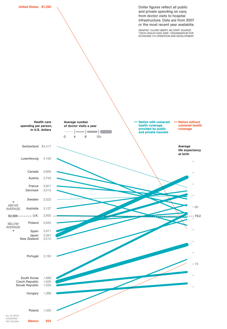
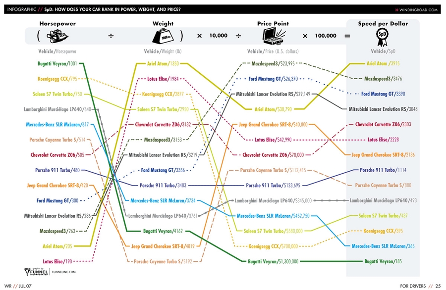
In the examples I gave the other day, we saw two charts (baseball and speed-per-dollar) that could be classified as bumps charts. Interestingly, although, by comparing different things along the two Y-axes, they both had flavors of Maurice d’Ocagne’s / Al Inselberg’s Parallel Coordinate Plots.

Parallel Coordinate Plots

I mentioned these in passing in the post the other day, but wanted to give a little more context on these.

While I won’t go deep on PCPs, they’re basically a means of comparing different items across a range of criteria. The idea is that you have more than one vertical axis, and each vertical axis shows how the item performed according to that specific criterion.

For example, Jon Peltier made this Parallel-Coordinates Plot comparing the performance of baseball players, measuring their on-base, power, base-running, and fielding percentages:

http://peltiertech.com/WordPress/composite-baseball-player-evaluation/

If you’re new to PCPs, it’s important to note that even though there’s a line present, PCPs aren’t measuring performance over time.

If you want to see a really good example of a parallel-coordinate plot, head over to the Juice Analytics “spike chart” of NFL team performance. In their words, “Our NFL stats ‘spike chart’ is an easy way to see who’s leading the league in passing, rushing, receiving, tackles, team offense, and team defense. By showing key metrics side by side, you get the full picture of a player or team performance–not just the highlights.” It’s a well-done tool. (Although it’s not trying to necessarily draw in the slopes of a normal PCP, which I think is a good thing. See the next paragraph for why.)

So are parallel coordinate plots slopegraphs? Generally, I’d say they aren’t. Why? In most PCPs, the slope across the entire chart carries no meaning. The line is there only to aid your eye in tracking an individual agent’s values across the chart. Switching the order of the columns – and changing their slope – doesn’t change the general outcome of the chart.

Look at the PCP above, comparing baseball performance. If you switched the order of the columns, so the slopes were different, would that change the information the chart carries? Not at all. If the order were “Power, On Base, Fielding, Running”, such that both lines angled downwards as you go from left-to-right, that wouldn’t be any different than if the order were reversed, and the slopes of both had an upward trend across the chart.

I mentioned above that in my original slopegraph piece, the salary-per-dollar and speed-per-dollar charts both had aspects of PCPs. Do I still consider them slopegraphs? Yes and kind of. Both charts are a cross between a PCP and a Bumps Chart. For another example of this PCP/BC cross, check out this interactive chart comparing different countries’ rankings in innovation from GE, designed by Pentagram’s Lisa Strausfeld.

For Ben Fry’s Baseball Chart, there are only two criteria: each team’s win-loss ratio and each team’s budget. As such, you can think of it as “a super-close zoom-in on a parallel-coordinates plot”. In this case, the slope does carry meaning. The gradient matters.

So should I have included the Speed Per Dollar example as a slopegraph? I’ve gone back and forth on this, and I think, ultimately, I should have included it, but I should have noted that rather than being a slopegraph, it’s actually several slopegraphs, pinned together. It’s horsepower vs. weight, and weight vs. price, and price vs. performance.

And now that I think about it, seeing it in that light, it might be even better if it were presented as horsepower divided by weight, to get a “hypothetical speed value”, and then to use that new metric as the value to compare with the price. So you’d have a single slopegraph, of the “speed” (or whatever you’d call that metric) in one column and the “price” in another column. Then, you’d have steeper lines showing better (or worse) values. And once you do all that, you’d have (effectively) the same chart that Ben Fry had, with his win-ratio/budget chart.

As a sidenote on the Speed Per Dollar example, one of you (Kyle Harr) astutely noted in an e-mail to me:

In the WindingRoad graph, all columns are arranged according to descending ‘value’: that is, lower weights and prices are better and therefore appear at the top of the column while higher horsepower is more desirable and also appears at the top of the column.

This does cause certain models to jump rather drastically between columns, adding some clutter, but that’s the point: a car like the Veyron may yield absolute best performance, but in the end, it’s not a very efficient way to get it.

While the WindingRoad graph is substantially more cluttered, the colored and patterned lines do make it relatively straight forward to read. Dave’s design was cleaner in other areas but reordering the columns obscures critical information in my opinion.

I agree: I do still think it was smart of Dave to swap the weight and horsepower columns, but keeping “more horsepower at the top” would probably have been better.

As a final note on PCPs, I just want to say that I’m not a huge fan of them overall. I can see some of their general utility, but I suspect that in many cases where PCPs are used, the data (and the reader) might be better served by chunking the data into multiple charts, each one highlighting certain pieces of information and answering specific questions.

Ladder Graphs

A term that’s occasionally been used for sloped graphs is the “ladder graph”. A ladder graph is actually very close to a slopegraph. Kurt Heisler, of the U.S. Department of Health and Human Services, e-mailed me with info on ladder graphs, and pointing to a few examples. He notes: “A common step in Concept Mapping is to ask participants to take a list of statements and rate them according to their importance, relevance, etc. to the “concept” being studied. The statement ratings are analyzed quantitatively with pattern matching, a process that groups statements into clusters based on similarities on how they were rated. Each cluster, then, has its own average rating. If you want compare how two groups rated each cluster, compare ratings between Time 1 and Time 2, or compare how clusters were rated using two different rating scales, you use a Ladder Graph. Because of the number of data points, you can also measure agreement with correlation statistics.”

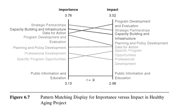
Basically, if the group in the left column agrees with the group in the right column about priorities and whatnot, the slopes will all be 0°, and will all line up.

So isn’t a ladder graph just another name for a slopegraph? Not quite.

The key distinction between the two: A ladder graph compares the forced ranking of multiple variables among two groups. A slopegraph, though, would be a good candidate for showing “a progression of univariate data among multiple actors over time”.

Kurt Heisler also pointed out a few more examples of ladder graphs, for those looking to drill a bit deeper:

Some New Slopegraph Examples

Happily, I’ve learned of several other slopegraphs that existed before the post earlier this week. Happily, too, several charts have been developed since then.

Slopegraphs From Before The Article

I’ve tried to include these chronologically.

Graphing Agreement and Disagreement

In 2004 and 2009, Nicholas Cox at the University of Durham wrote “Speaking Stata: Graphing agreement and disagreement” (2004). He also wrote “Speaking Stata: Paired, parallel, or profile plots for changes, correlations, and other comparisons” (2009). Both appeared in The Stata Journal. He includes a number of examples of slopegraphs, and includes some alternative representations for when a chart’s rendering must be done by a computer (for example: avoiding label collision by plotting each item vertically or horizontally, each in its own column, in Tukey-style quasi-whiskerplot).
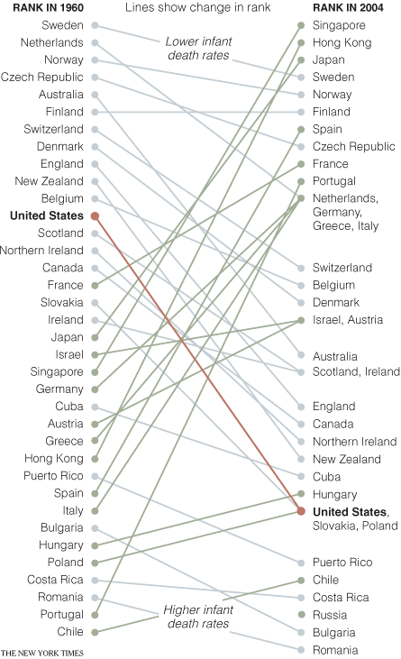
Infant Mortality

In April of 2009, the New York Times showed a comparison of infant mortality rates from 1960 to 2004:

http://www.nytimes.com/imagepages/2009/04/06/health/infant_stats.html

A few things to note: They resolve the issue of tie-breaking by having the points converge, and listing the tied countries in order of their original ranking from the left side of the chart. Their labeling could have been made clearer by including the actual rank number next to each rank endpoint on the chart (there’s no way to tell at a glance how many places the US dropped, for example). By including the rank number, it would also eliminate the need for the “Lower infant death rates” and “Higher infant death rates” labels.

Also, in an e-mail from Dr. Michael MacAskill, he notes: “The problem with this example is that it also departs from Tufte’s example by using ranks rather than the actual values. Ranks are unstable when dealing with values with little real variation (such as child mortality rates in developed countries), in this case giving the erroneous impression of a substantial change in US mortality rates.” I’ll discuss this a bit more down below, in the “relative vs. absolute” portion of the more best practices section.

College Tuition and Fees

In September of 2009, Tom Schenk developed this slopegraph, comparing Iowa’s tuition and fee changes with those of surrounding states:

http://tomschenkjr.net/2010/11/10/not-everything-is-under-insert-non-traditional-basic-graphs/

Jobs in the Netherlands

Also in 2009, while working for the Dutch province of Flevoland, Joshua de Haseth made a slopegraph showing economic data and job growth among different Dutch provinces.

He made the chart in Excel, and since he wrote it as “in Excel (!)”, I’m guessing it wasn’t the easiest chart to make. Maybe Microsoft will try to steal the term “slopegraph” as well as sparkline, and this will be a walk in the park in a few years.

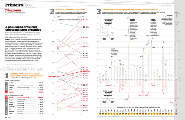
Brazilian Prison Population Change

In November of 2010, Brazilian newsweekly Época showed a visualization of the increasing prison population across the country.

http://colunas.epoca.globo.com/fazcaber/2011/03/25/editora-globo-ganha-dois-premios-malofiej/

You can see a larger version of this at the Epoca website (click on the large “2” at the top of the chart on that page).

This chart won a Malofiej prize, an international contest described as “the infographics equivalent of the Pulitzer Prizes”, awarded by the Spanish chapter of the Society for News Design

Medicare Adoption

In April of 2011, Brent Jones at the St. Louis Observer created a chart showing Medicare adoption rates in different states. This is more of a PCP/Bumps cross than a slopegraph, but I wanted to link to it here anyway.

The Canadian Power List

Im May of 2010, Grant Hamilton at the Brandon Sun published a quasi-slopegraph/bumps chart looking at a listing of power brokers in the Brandon area of Manitoba. Like the Medicare Adoption link above, I won’t analyze this one too much here, but I wanted to mention it.

The Tablet Effect

On July 11, 2011 …

http://www.resolvemr.com/

Ironically, this one was published online on the same day as my original article. It comes from an industry report created by Resolve Market Research.

I have a few quibbles with this one, but it’s a good example of a slopegraph.

Apart from general eyecandy issues, two specific slopegraph concerns: * In the chart as it was originally presented, it isn’t clear at a glance whether the textual labels (the %s) are the comparison points, or whether the ends of the lines themselves are the comparison points. (Here, the chart’s been shrunken a bit, but you can see it at its full size by clicking here.) After a second or two, you see that the percentage labels are simply giving a more complete picture of the data, and it’s the lines that carry the dominant data. But because the labels have a higher contrast from the black background than the lines, the eye is drawn to the percentages. One way to handle this would be to make the percentage labels less contrasting from the background, rather than white, so they stand out less. * Also, the legend should probably disappear altogether, and the names of the different readers could be appended to one (or both) of the percentage labels.

Slopegraphs Since The Article

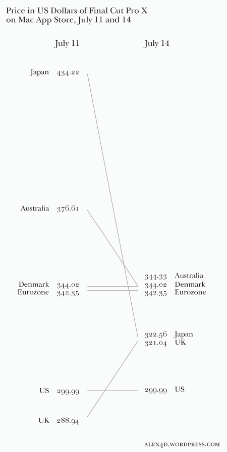
Final Cut Pro Price Changes

On July 14th, 2011, Alex Gollner posted this slopegraph comparing price changes of Apple’s Final Cut Pro X:

http://alex4d.wordpress.com/2011/07/14/fpx-july-2011-price-changes/

Defense Spending

On July 15th, 2011, Gulliver posted slopegraphs of NATO defense spending as a percentage of GDP.

http://tachesdhuile.blogspot.com/2011/07/fun-with-slopegraphs-nato-defense.html

Military Expenditure in East Asia

Also on July 15th, 2011, Per Henrik Johansen used David Ruaru’s slopegraphs in R script to create a slopegraph showing military expenditures in 2000 and 2010:

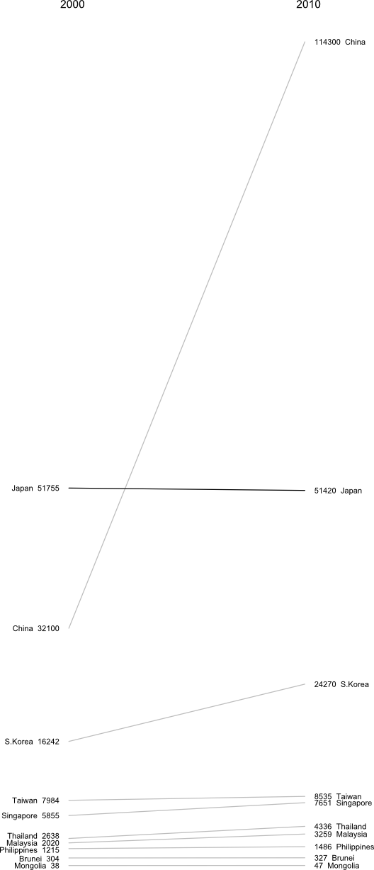
http://blog.perhenrik.com/2011/07/military-expenditure-in-east-asia-as.html

He describes the creation of the chart as “a piece of cake”.

GDP Per Capita Among The World’s Poorest Countries

Also on July 15th, 2011, Jon Custer developed a slopegraph comparing GDP per capita, from 1959 to 2009.

http://amoondisaster.wordpress.com/2011/07/15/telling-stories-with-data-the-slopegraph/

He also goes in-depth on the process he went through in making the chart, what he liked about it, and where he would like to see it improve. If you have any interested in making slopegraphs, his post is well worth a look. As a preview:

However, what I really like about this style of presentation is that it breaks the story down into discrete sub-narratives by country and decade. As I alluded to yesterday, I am somewhat skeptical of tendency in development economics to focus on large-scale trends — with the implication often being that this will allow us to devise ‘universal’ rules. Too often economists write off the outliers as uninteresting, unimportant, or even harmful to their analysis. But given the rarity of the outcome development economists are searching for — poor country becomes rich country — it seems like the outliers are exactly what they should be focusing on. Looking at this chart, the natural question for the uninitiated would be “What’s the deal with China?” not “Hey, what’s up with Burkina Faso, Ethiopia, and Malawi?”

This chart also helps to generate questions that would not be so obvious in a more granular presentation, especially to those not accustomed to reading charts, as the human brain is pretty good at recognizing and comparing the slopes of straight lines. Looking at the chart for a few minutes quickly reveals the important moments in the economic histories of these diverse countries: what happened in Uganda in the 70s? China in the 80s? Most countries in the 2000s? And what the hell is wrong with Zimbabwe? You can also discern other interesting pieces of data, such as the fact that economic dynamo India actually only surpassed economic basketcase Pakistan in per-capita GDP relatively recently. Some countries have been particularly volatile, like Malawi, while Morocco was a good, steady performer. You really lose surprisingly little meaning compared to the conventional line chart, especially considering the number of distractions which are eliminated.

Whiskerslopes

As I mentioned in the original piece, handling overlapping labels is tricky.

One interesting approach to handling that was proposed by Mike Stone. He added a version of Tufte’s “revised box plot” to each axis, showing the median value, the quartiles on each axis (the lines run from the 75% point to the 90% point (above the median) and the 25% point to the 10% point (below the median)).

Here’s how he described it, in an e-mail to me:

The whisker diagrams have the same general effect as the hairline between rows of numbers in a table. They break the textual data into smaller chunks which are easier for the reader to process. By my estimation, there are fourteen easily resolved buckets for information on either side: top, middle, and bottom for each line, same for the spaces between the lines and the median dot, plus ‘everything above the top line’ and ‘everything below the bottom line’.

Grouping the textual information in those buckets released me from the problem of using the text as a data point per se. I was able to make the graphical information do what it does well – showing the relationships between values – while letting the text do what it does well – telling us the exact values associated with the lines nearby.

Given that slopegraphs are best suited to numerical data, the whisker diagrams do provide meaningful information. Best of all, they give a lot of bang for the buck while maintaining the ‘pure data ink’ character of the original chart.

At first, I was thrown by the added lines, but I think he’s right, that by introducing the vertical lines, it isn’t as necessary for the text labels to line up as closely with the endpoints of the lines.

I think the added vertical lines would need to be added carefully, but they do add to the chart. Mike continues:

[adding the whisker lines highlights] the oddball values. Britain skipped from the top quartile to just below average. Canada, Greece, and the US all dropped roughly half a bracket. Finland went from ‘a bit above average’ to ‘a bit below average’. Everyone else stayed about where they started, with France and Belgium moving from the high and low ends of their bracket toward the middle.

Thing is, that’s not obvious from the slopes of the lines. The lines for Greece and Spain are nearly parallel, but it’s Spain and Switzerland that more or less define the 10-25% bracket.

I’m eager to see how you all take this enhancement and refine it and run with it. Again, it’s not always going to be practical or necessary to add it, but you might find that it enhances your charts, and frees you up from some of the problem of label collisions.

More Best Practices

I wanted to point out three “best practices” that I’d neglected to mention the first time around.

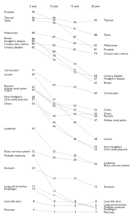
First, if you have multiple comparisons (as in the cancer slopegraph), maintain a consistent scale for the horizontal alignment of your columns. In the cancer scale, that was a 5-year period. In the NATO defense budgets example I linked to above, that was a 3-year period.

If you have data that spans a 10-year gap as your first line of slopes, and then an update to the dataset only covers a five-year gap, you need to be careful how you place your columns. If they’re equidistant from one another, the relative gradients will be misrepresented.

Second, be clear about whether the “comparison point” on the chart is the end of the slope line or the data label itself.

I touched on this a bit with my critiques of the “Tablet Effect” slopegraph above.

Third, determine whether you want to highlight the absolute rate of change or the fractional rate of change.

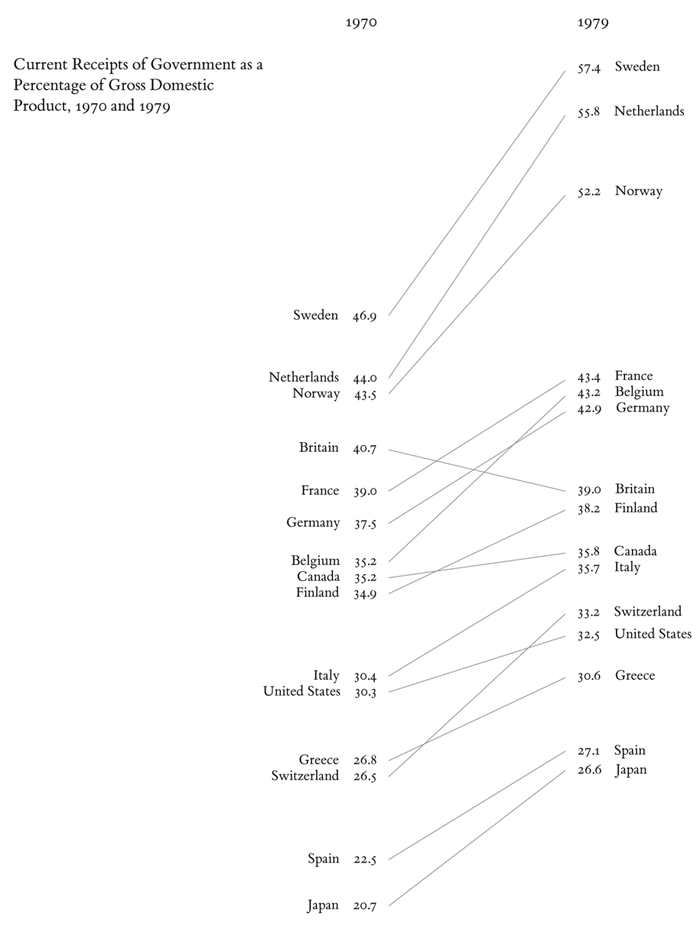
Earlier, I mentioned Michael MacAskill’s critique of the Times’ “Infant Mortality” chart. A similar point was made in an e-mail to me from Terry Carlton, who noted:

A country’s slope in this graph is larger, the larger the increase in what is being graphed, namely, government receipts as a percentage of GDP. But comparing slopes could be misleading. Suppose that for country A, the increase is from 10% in 1970 to 20% in 1979, whereas for country B the increase is from 40% to 50%. The slope for both countries would be the same even though what is graphed doubles between 1970 and 1979 for country A, but increases by only a fourth (i.e., by 25% of the original 40%) for country B.

Next, consider country C, for which government receipts as a percentage of GDP increase from from 40% in 1970 to 60% in 1979. The slope for C would be twice that for A, yet the fractional increase in what is being graphed is twice as large for A as for C.

I suspect that many users of slopegraphs would be more interested in the fractional increase of what is being graphed rather than in the absolute increase. A slope graph that used a logarithmic vertical scale would have equal slopes for equal fractional changes, and the larger of two slopes would always be associated with the larger fractional change.

It’s a good point. If the comparative rate-of-change is the most salient aspect of the data that you’re highlighting, consider making your slopegraph’s axes reflect the percentage of change. I suspect this would end up having a midpoint on the left-hand axis (0%), with the different slopes fanning out above and below the 0% line to the right hand axis, which would have positive percentage values above the mid-line, and negative values below.

You might have two different slopegraphs: One showing the absolute change, and one showing the relative change. Alternately, include the secondary data point in parentheses, after the right-hand label (so, in the original GDP example, you could label Sweden’s right-hand datapoint “57.4 Sweden (22.4%)”; Britain’s would be “39.0 Britain (-4.2%)”.

New Slopegraph Software

It’s been neat seeing new software implementations developing. I’ll add these to the original post, but I wanted to call them out here, for people looking for the update.

Wrapping Up (Again)

So, yeah: I think slopegraphs have a promising future. It’s been exciting to see the activity surrounding them this week, and to be a part of it.

I think the most succinct description I saw came from Nat Torkington at O’Reilly’s Radar, who said “[slopegraphs convey] rank, value, and delta over time.” That’s a pretty high data-to-ink ratio right there. Far better than my blabbering.

As you develop more slopegraphs in the future, I’d encourage you to post them at Edward Tufte’s forum thread on slopegraphs. And, of course, let me know, on Twitter or by e-mail (charlie@pearbudget.com), what you come up with. I’m looking forward to it.

Edward Tufte’s “Slopegraphs” /slopegraphs 2011-07-11T00:00:00-07:00 2011-07-11T00:00:00-07:00

After you read this post, you’ll probably want to check out the follow-up, A Slopegraph Update.

Back in 2004, Edward Tufte defined and developed the concept of a “sparkline”. Odds are good that — if you’re reading this — you’re familiar with them and how popular they’ve become.

What’s interesting is that over 20 years before sparklines came on the scene, Tufte developed a different type of data visualization that didn’t fare nearly as well. To date, in fact, I’ve only been able to find three examples of it, and even they aren’t completely in line with his vision.

It’s curious that it hasn’t become more popular, as the chart type is quite elegant and aligns with all of Tufte’s best practices for data visualization, and was created by the master of information design. Why haven’t these charts (christened “slopegraphs” by Tufte about a month ago) taken off the way sparklines did?

In this post, we’re going to look at slopegraphs — what they are, how they’re made, why they haven’t seen a massive uptake so far, and why I think they’re about to become much more popular in the near future.

The Table-Graphic

In his 1983 book The Visual Display of Quantitative Information, Tufte displayed a new type of data graphic.

Tufte, Edward. The Visual Display of Quantitative Information.
Cheshire, Connecticut: Graphics Press; 1983; p. 158

As Tufte notes in his book, this type of chart is useful for seeing:

  • the hierarchy of the countries in both 1970 and 1979 [the order of the countries]
  • the specific numbers associated with each country in each of those years [the data value next to their names]
  • how each country’s numbers changed over time [each country’s slope]
  • how each country’s rate of change compares to the other countries’ rates of change [the slopes compared with one another]
  • any notable deviations in the general trend (notice Britain in the above example) [aberrant slopes]

This chart does this in a remarkably minimalist way. There’s absolutely zero non-data ink.

(One important thing to note is that this chart shows the same types of data on the left and right sides, using the same units of measurement. I’ll come back to this later.)

So, anyway, Professor Tufte made this new kind of graph. Unlike sparklines, though, it didn’t really get picked up. Anywhere.

My theory on this lack of response is three-fold:

  1. It didn't have a name. (He just referenced it as a "table-graphic" at the time.)
  2. It was a totally new concept. (Where sparklines are easily understood as "an axis-less line chart, scaled down (and kind of cute)", this "table-graphic" is something new.)
  3. It's a little good deal more complicated to draw. (More on that at the end.)

A Super-Close Zoom-In On A Line Chart

A quick aside: The best way I’ve found to describe these table-graphics is this: It’s like a super-close zoom-in on a line chart, with a little extra labeling.

Imagine you have a line chart, showing the change in European countries’ population over time. Each country has a line, zigzagging from January (on the left) to December (on the right). Each country has 12 points across the chart. The lines zigzag up and down across the chart. Now, let’s say you zoomed in to just the June-July segment of the chart, and you labeled the left and right sides of each country’s June-July lines (with the country’s name, and the specific number at each data point).

That’s it. Fundamentally, that’s all a table-graphic is.

Hierarchical Table-Graphics In The Wild

Where sparklines found their way into products at Google (Google Charts and Google Finance) and Microsoft (grrr), and even saw some action from a pre-jQuery John Resig (jspark.js), this table-graphic thing saw essentially zero uptake.

At-present, Googling for “tufte “table-graphic”” yields a whopping 83 results, most of which have nothing to do with this technique.

Actually, since Tufte’s 1983 book, I’ve found three non-Tuftian examples (total). And even they don’t really do what Tufte laid out with his initial idea.

Let’s look at each of them.

Ben Fry’s Baseball Chart

The first we’ll look at came from Processing developer / data visualization designer Ben Fry, who developed a chart showing baseball team performance vs. total team spending:

http://benfry.com/salaryper/

A version of this graphic was included in his 2008 book Visualizing Data, but I believe he shared it online before then.

Anyway, you can see each major-league baseball team on the left, with their win/loss ratio on the left and their annual budget on the right. Between them is a sloped line showing how their ordering in each column compares. Lines angled up (red) suggest a team that is spending more than their win ratio suggests they should be, where blue lines suggest the team’s getting a good value for their dollars. The steeper the blue line, the more wins-per-dollar.

There are two key distinctions between Tufte’s chart and Fry’s chart.

First: Fry’s baseball chart is really just comparing order, not scale. The top-most item on the left is laid out with the same vertical position as the top-most item on the right, and so on down the list.

Second: Fry’s is comparing two different variables: win ratio and team budget. Tufte’s looks at a single variable, over time. (To be fair, Fry’s does show the change over time, but only in a dynamic, online version, where the orders change over time as the season progresses. The static image above doesn’t concern itself with change-over-time.)

If you want to get technical, Fry’s chart is essentially a “forced-rank parallel coordinates plot” with just two metrics.

Another difference I should note: This type of forced-rank chart doesn’t have any obvious allowance for ties. That is, if two items on the chart have the same datum value (as is the case in 11 of the 30 teams above), the designer (or the algorithm, if the process is automated) has to choose one item to place above the other. (For example, see the Reds and the Braves, at positions 6 and 7 on the left of the chart.) In Fry’s case, he uses the team with the lower salary as the “winner” of the tie. But this isn’t obvious to the reader.

In Visualizing Data, Fry touches on the “forcing a rank” question (p. 118), noting that at the end of the day, he wants a ranked list, so a scatterplot using the X and Y axes is less effective of a technique (as the main point with a scatterplot is simply to display a correlation, not to order the items). I’m not convinced, but I am glad he was intentional about it. I also suspect that — because the list is generated algorithmically — it was easier to do it and avoid label collisions this way.

Nevertheless, I do think it’s a good visualization.

The National Geographic Magazine Life-Expectancy Chart

In 2009, Oliver Uberti at National Geographic Magazine released a chart showing the average life expectancy at birth of citizens of different countries, comparing that with what each nation spends on health care per person:

http://blogs.ngm.com/blog_central/2009/12/the-cost-of-care.html

Like Fry’s chart, Uberti’s chart uses two different variables. Unlike Fry’s chart, Uberti’s does use different scales. While that resolves the issue I noted about having to force-rank identical datapoints, it introduces a new issue: dual-scaled axes.

By selecting the two scales used, the designer of the graph — whether intentionally or not — is introducing meaning where there might not actually be any.

For example, should the right-side data points have been spread out so that the highest and lowest points were as high and low as the Switzerland and Mexico labels (the highest and lowest figures, apart from the US) on the left? Should the scale been adjusted so that the Switzerland and/or Mexico lines ran horizontally? Each of those options would have affected the layout of the chart. I’m not saying that Uberti should have done that — just that a designer needs to tread very carefully when using two different scales on the same axis.

(Stephen Few discusses this concept of dual-scaled axes — although he isn’t talking about this chart type — in his March 2008 newsletter.)

A few bloggers (Jon Peltier, for example) criticized the NatGeo chart, noting that, like the Fry chart above, it was an Inselberg-style parallel-coordinates plot, and that a better option would be a scatter plot. (I disagree that it’s really a parallel-coordinates plot, as parallel-coordinate plots usually compress everything into a unified vertical axis height, so the scale is somewhat pre-determined. I digress.)

In a great response on the NatGeo blog, Uberti then re-drew the data in a scatter plot:

Uberti also gave some good reasons for drawing the graph the way he did originally, with his first point being that “many people have difficulty reading scatter plots. When we produce graphics for our magazine, we consider a wide audience, many of whose members are not versed in visualization techniques. For most people, it’s considerably easier to understand an upward or downward line than relative spatial positioning.”

I agree with him on that. Scatterplots reveal more data, and they reveal the relationships better (and Uberti’s scatterplot is really good, apart from a few quibbles I have about his legend placement). But scatterplots can be tricky to parse, especially for laymen.

Note, for example, that in the scatter plot, it’s hard at first to see the cluster of bubbles in the bottom-left corner of the chart, and the eye’s initial “read” of the chart is that a best-fit line would run along that top-left-to-bottom-right string of bubbles from Japan to Luxembourg. In reality, though, that line would be absolutely wrong, and the best-fit would run from the bottom-left to the upper-right.

Also, the entire point of the chart is to show the US’s deviant spending pattern, but in the scatter plot, the eye’s activity centers around that same cluster of bubbles, and the US’s bubble on the far right is lost.

The “Above average spending / Below average life expectancy” labels on the quadrants are really helpful, but, again, it reinforces Uberti’s point, that scatter plots are tricky to read. Should those labels really be necessary? Without them, would someone be able to glance at the scatter chart and “get it”?

For quick scanning, the original chart really does showcase the extraordinary amount the US spends on healthcare relative to other countries. And that’s the benefit of these table-graphics: Slopes are easy to read.

Speed Per Dollar

Back in July of 2007 (I know: we’re going back in time a bit, but this chart diverges even more from Tufte’s than the others, and I wanted to build up to it), a designer at online driving magazine WindingRoad.com developed the “Speed per Dollar” index:

Again, what we have is, essentially, an Inselberg-style parallel-coordinates plot, with a Fry-style forced-rank. In this case, though, each step of the progression leads us through the math, to the conclusion at the right-side of the chart: dollar-for-dollar, your best bet is the Ariel Atom.

Homina homina homina.

Anyway, this chart uses slopes to carry meaning, hence its inclusion here, but I think it’s different enough from the table-chart Tufte developed in 1983 that it isn’t quite in the same family.

Dave Nash, a “kindly contributor” at Tufte’s forum then refined the chart, making aspects of it clearer and more Tuftian (original graphic on top, Nash’s on bottom):

(I like how the original included the math at the top of the chart, showing how the SPD value was derived, and I like how it highlights the final column, drawing the eye to the conclusions, but I do think Nash’s shows the data better.)

Cancer Survival Rates

We’ll close with the last example of these table-charts I’ve found (and I’ve looked for others; if you know any others, let me know: (charlie@pearbudget.com).

This one’s from Tufte himself. It shows cancer survival rates over 5-, 10-, 15-, and 20-year periods.

http://www.edwardtufte.com/bboard/q-and-a-fetch-msg?msg_id=0000Jr

Actually, the chart above is a refinement of a Tufte original (2002), done (again) by Kindly Contributor Dave Nash (2003, 2006).

Owing it to being a creation of the man himself, this is most in-line with the table-chart I showed at the very top, from 1983. We can clearly see each item’s standings on the chart, from one quinquennium to the next. In fact, this rendition of the data is a good illustration of my earlier simplification, that these table-charts are, essentially, minimalist versions of line charts with intra-line labels.

Tufte Names His Creation

Although it’s possible that Tufte has used this term in his workshops, the first occasion I can find of the “table-chart” having an actual name is this post from Tufte’s forums on June 1st, 2011. The name he gives the table-chart: “Slopegraphs”.

I suspect that we’ll see more slopegraphs in the wild, simply because people will now have something they can use to refer to the table-chart besides “that slopey thing Tufte had in Visual Design.”

But there’s still a technical problem: How do you make these damn things?

Making Slopegraphs

At the moment, both of the canonical slopegraphs were made by hand, in Adobe Illustrator. A few people have made initial efforts at software that aids in creating slopegraphs. It’s hard, though. If the labels are too close together, they collide, making the chart less legible. A well-done piece of software, then, is going to include collision-detection and account for overlapping labels in some regard.

Here are a few software tools that are currently being developed:

In each case, if you use the chart-making software to generate a slopegraph, attribute the software creator.

With this many people working on software implementations of slopegraphs, I expect to see a large uptick in slopegraphs in the next few months and years. But … when should people use slopegraphs?

When to Use Slopegraphs

In Tufte’s June 1st post, he sums up the use of slopegraphs well: “Slopegraphs compare changes over time for a list of nouns located on an ordinal or interval scale.”

Basically: Any time you’d use a line chart to show a progression of univariate data among multiple actors over time, you might have a good candidate for a slopegraph. There might be other occasions where it would work as well. Note that strictly by Tufte’s June 1st definition, none of the examples I gave (Baseball, Life Expectancy, Speed-per-Dollar) count as slopegraphs.

But some situations clearly would benefit from using a slopegraph, and I think Tufte’s definition is a good one until more examples come along and expand it or confirm it.

An example of a good slopegraph candidate: In my personal finance webapp PearBudget, we’ve relied far more on tables than on charts. (In fact, the only chart we include is a “sparkbar” under each category’s name, showing the amount of money available in the current month.) We’ve avoided charts in general (and pie charts in particular, unlike every other personal finance webapp), but I’m considering adding a visual means of comparing spending across years — how did my spending on different categories this June compare with my spending on those categories in June of 2010? Did they all go up? Did any go down? Which ones changed the most? This would be a great situation in which to use a slopegraph. (If I do implement them, I’ll be sure to post a follow-up with screenshots and an explanation of how I got them to work.)

Slopegraph Best Practices

Because slopegraphs don’t have a lot of uses in place, best practices will have to emerge over time. For now, though …

  • Be clear — first to yourself, then to your reader — whether your numbers are displaying the items in order or whether they’re on an actual scale.
    • Note how on Tufte’s original chart, Belgium and Canada have the same left-side value (35.2), but are placed at different vertical positions (ordinal), but how the cancer survival chart positions Kidney and Colon cancers — both with the same left-side value (62) — at the same vertical point.
    • An important consideration: is the primary purpose of the chart to show the relative rate of change for each item over time? The absolute values for each item? Both pieces of information? Knowing this will help you make decisions about scaling and labeling.
  • If the datapoints or labels are bunching up, expand the vertical scale as necessary.
  • Left-align the names of the items on both the left-hand and right-hand axes, to make vertical scanning of the items’ names easier.
  • Include both the names of the items and their values on both the left-hand and right-hand axes.
  • Use a thin, light gray line to connect the data. A too-heavy line is unnecessary and will make the chart harder to read.
  • But: When a chart features multiple slope intersections (like the baseball or speed-per-dollar charts above), judicious use of color can avoid what Ben Fry describes as the "pile of sticks" phenomenon (Visualizing Data, 121).
  • A table (with more statistical detail) might be a good complement to use alongside the slopegraph. As Tufte notes: “The data table and the slopegraph are colleagues in explanation not competitors. One display can serve some but not all functions.”
  • Defer to current best practices outlined by Tufte, Stephen Few, and others, including maximizing data-to-ink ratios, minimizing chartjunk, and so on.

Wrapping Up

That’s about it for now. I’ll try to update this post as more examples surface.

I would like to thank Matt Frost, David Ruau, and Edward Tufte for reading drafts of this article, and to the commenters on the edwardtufte.com forums for their enlightening posts over the years.

If you see a slopegraph out in the wild, or if you have any feedback on this post, shoot me a note on Twitter (@charliepark) or by e-mail (charlie@pearbudget.com). I look forward to learning more from you.

Now that you’ve made it through this post, you’ll probably want to check out the follow-up, A Slopegraph Update. There, we cover things like “bumps charts”, parallel coordinate plots, ladder charts, and we see a whole raft of examples of slopegraphs in the wild. Some from before the post you just read, some inspired by it. It’s here: http://charliepark.org/a-slopegraph-update.

Fear-Driven Development /fear-driven-development 2011-06-26T00:00:00-07:00 2011-06-26T00:00:00-07:00

A useful heuristic I’ve been using lately for determining where I should focus my attention:

What are you most afraid of?

What would it take for that fear to be eliminated?

That's what you should be working on.

I call it Fear-Driven Development.

I wanted to write more, but I was afraid I’d just keep fiddling with it and wouldn’t actually get this posted. So here you go.

Jekyll + Plugins + Github + You /jekyll-with-plugins 2011-06-15T00:00:00-07:00 2011-06-15T00:00:00-07:00

Github’s Pages is a great “it just works” resource.

Except for when it doesn’t work.

So, for some reason, tags aren’t fully-implemented in Jekyll. They kind of work, but there’s no tag archive page. I went over this in my post on getting tags to work in Jekyll. The problem with that, though, is that Github disables any plugins you’re using when it processes/creates your blog (that’s what the --safe tag does).

How, then, do you get your blog (with tags) to load up on Github?

(I’m operating under the assumption here that you already have a Jekyll-powered blog set up on Github Pages, such that when you push commits to Github, it regenerates your blog for you.)

I’m going to lay out how to do this, and then how to automate the whole process so you can do it in just a few keystrokes.

1. Split Your Blog in Two

The first step is to clone your repo into a duplicate local copy. In my case, I took my local copy ~/applications/charliepark.github.com and cloned it to ~/applications/charliepark.github.com.raw.

This leaves you with the “raw” directory and the original directory (both identical).

2. Remove Your Old Content

In Finder, go into your original directory (again, in my case: ~/applications/charliepark.github.com) and delete all of the content. You do not want to do this via the command line, as it’ll either be tedious (you’d need to remove each directory / file) or it’ll be too aggressive, and you’ll lose your .git directory. The point here: You don’t want to lose your .git directory, as that’s how your local copy will talk to your repo at Github.

You should now have the “raw” directory (again, a clone of what you have at Github) and the now-empty (apart from your .git directory) original repo.

3. Regenerate Your Blog, in the “raw” Directory

This is pretty straightforward. Just cd to the raw directory … in my case:

cd ~/applications/charlie.github.com.raw

… and run the jekyll command.

This will regenerate your blog, in the ~/applications/charlie.github.com.raw/_site directory. You’ve probably already done this step once or twice before. (Note: You don’t want to run jekyll --server, as the point here is just to generate the blog, not to fire up a server.)

4. Copy the _site Directory Over To Your Original Repo

This is simple.

cp -r ~/applications/charliepark.github.com.raw/_site/* ~/applications/charliepark.github.com

Once you’ve run that command, you’ll now have: 1. Your “raw” directory 2. A subdirectory within the “raw” directory (_site), with the generated HTML 3. Your original directory, whose contents should now mirror the _site subdirectory of the “raw” directory

5. Add .nojekyll

When you add a file titled .nojekyll to your repo, Github won’t process your files as Jekyll files. I don’t think this step is strictly necessary, as we’re just sending the straight-up HTML files. But it can’t hurt. In your original directory (~/applications/charliepark.github.com), run:

touch .nojekyll

6. Commit and Push Your Repo

Add the files to your original directory’s git repo:

git add .

Commit the new version of the repo:

git commit -am "Converts to flat HTML files."

(Note: Your commit flags (-am) might differ from mine.)

Push the code to Github:

git push

7. Your Site Should Be Live

You can now go to your site (http://yourusername.github.com) and see your site.

8. Automate The Whole Thing

Once you’ve checked that it works, and that everything’s okay, it’s a good idea to automate the whole thing.

I added a shortcut to my ~/.bash_profile file:

alias build_blog="cd ~/applications/charliepark.github.com.raw; jekyll;cp -r ~/applications/charliepark.github.com.raw/_site/* ~/applications/charliepark.github.com;cd ~/applications/charliepark.github.com;git add .;git commit -am 'Latest build.';git push"
alias bb="build_blog"

So, now, once I’ve written a new post, or edited a post, or just want to get the site refreshed for some other reason, all I have to do in my command line is type bb, and it’ll regenerate the site, copy it over, run the git commits, and push it live to Github. I can now finish my post and then push it live to the site in about a second.

And it has tags.

Corrections?

I’m always half-expecting that some aspect of one of my writeups is totally broken. If you try this and have any issues, let me know (@charliepark). Similarly, if you try it and it works, let me know.

Benchmarking Date.today and Time.now in Ruby /benchmarking-date.today-and-time.now-in-ruby 2011-06-15T00:00:00-07:00 2011-06-15T00:00:00-07:00

Update: Ruby 1.9.3 revamped the Date class, and the info in this post is now out of date. In fact, it’s now totally wrong. If you’re using Ruby 1.9.3, it’s faster to call Date.today than Time.now.

♪ ♫ The more you know.

There are often times when I can handle a programming issue in one of two (or more) ways. Dealing with Time / Date objects is one of those situations.

For example, if you want to know what day today is, you can either fetch Date.today.day or Time.now.day.

In my head, Date is a much simpler concept than Time. After all, Time deals with things like milliseconds and Epochs and things like that, where Date … well, I woke up this morning, and it was today’s date. And when I get up tomorrow, it’ll be tomorrow’s date. “Date” seems much more tangible.

I was curious, though, to know if there was a difference in how quickly Ruby could process the two. So I ran a test.

The First Test

I was in a Rails app, so I fired up script/console, and added the following code:

require 'benchmark'

Benchmark.ms { 1000.times { puts Time.now } }

Benchmark.ms { 1000.times { puts Date.today } }

The Results

What I found was really interesting.

I ran the test a couple of times, and the average processing time for Time.now was 104 ms. The average processing time for Date.today was 251 ms.

That means it took Date.today about two and a half times as long to get processed than Time.now.

The Second Test

I was curious to see if those results would hold if I ran a more complicated test. So I made the processing a tiny bit trickier:

def month_name_t(month = Time.now.month)
  Date::MONTHNAMES[month]
end
Benchmark.ms { 1000.times { month_name_t } }

def month_name_d(month = Date.today.month)
  Date::MONTHNAMES[month]
end
Benchmark.ms { 1000.times { month_name_d } }

More Results

This time around, the difference was even more pronounced.

On average, month_name_t (Time.now) took 2 ms. And month_name_d (Date.today) took 80 ms.

So when we made the function just a bit more complex, it increased the processing time dramatically: Date.today took 40 times as long to process as Time.now.

The Conclusion

When you're processing Times and Dates in your app, and you don't *need* to use the Date object for some reason, use Time.

In case you missed it up top …

Update: Ruby 1.9.3 revamped the Date class, and the info in this post is now out of date. In fact, it’s now totally wrong. If you’re using Ruby 1.9.3, it’s faster to call Date.today than Time.now.

The old homepage /the-old-homepage 2011-06-08T00:00:00-07:00 2011-06-08T00:00:00-07:00

Just for posterity, I wanted to save / link to a copy of the old charliepark.org.

So it’s now here: oldindex.html.

Tags In Jekyll /tags-in-jekyll 2011-06-07T00:00:00-07:00 2011-06-07T00:00:00-07:00

Update: Using Github Pages to serve up your blog? Me, too! Even though plugins won’t work on Github Pages, you can still have tags on your site. You just need to generate the site locally, commit it to your repo, and Github will serve it up. (That’s what I’m doing here.) I explain exactly how I do it (and how I automated the whole process) in another post, Jekyll + Plugins + Github + You.

When I decided to convert my blog over to Jekyll, I was pretty excited about it. It seemed to offer the right balance between power and simplicity.

I realized pretty soon, though, that one of the main features I wanted to implement – tagging – isn’t well-supported in Jekyll.

I figured out how to get it working, though, and wanted to share what I came up with.

The Problem

I shouldn’t say that Jekyll doesn’t support tagging. It does. In the sense that you can add tags to a post.

But one of the necessary pages on a blog with tags is the tag archive page, where the blog automatically collects all posts tagged with “rails” or “experiments” or “recipes” or whatever.

For some reason, Jekyll doesn’t automatically produce those pages.

The Process

I looked at a number of different blogs, and at the source code for a number of different Jekyll-powered blogs. I also poked around at Stack Overflow and Google Groups. They were useful in that they pointed me in the right direction. But all assumed more familiarity with Jekyll than I have, or they had some other issue that prevented my “getting it”.

Eventually, I figured out how to make it work, mainly by abusing some “Categories in Jekyll” code that others had put online. My approach ended up being almost identical to some code I found at http://brizzled.clapper.org/id/105/index.html. In fact, I might have inadvertently lifted his code wholesale.

But nowhere in my escapades of ignorance did I find anyone who had written up an explanation of exactly what to do, where. So here you go.

The Solution

Jekyll recognizes tags out of the box. In your post’s YAML frontmatter, add tags like this:

tags:
- jekyll
- code

That sets up the post to have tags. To get the tags pulled onto a page, create two files:

_layouts/tag_index.html

and

_plugins/_tag_gen.rb

You probably already have a layouts directory, but you might need to add the plugins one. The tag_index.html file is necessary for the tag_gen.rb script to actually run.

In the tag_index file, put this:

---
layout: default
---
<h2 class="post_title">{.{page.title}}</h2>
<ul>
  {.% for post in site.posts %}
  {.% for tag in post.tags %}
  {.% if tag == page.tag %}
  <li class="archive_list">
    <time style="color:#666;font-size:11px;" datetime='{.{post.date | date: "%Y-%m-%d"}}'>{.{post.date | date: "%m/%d/%y"}}</time> <a class="archive_list_article_link" href='{.{post.url}}'>{.{post.title}}</a>
    <p class="summary">{.{post.summary}}</p>
    <ul class="tag_list">
      {.% for tag in post.tags %}
      <li class="inline archive_list"><a class="tag_list_link" href="/tag/{.{ tag }}">{.{ tag }}</a></li>
      {.% endfor %}
    </ul>
  </li>
  {.% endif %}
  {.% endfor %}
  {.% endfor %}
</ul>

Note: In some of the lines up there, it has a “{.%” … get rid of that period between the curly bracket and the percent sign or between the two curly brackets.

What that does: When this page is created (more on that in a sec), it’ll have a specific tag assigned to it. That is, multiple pages will be created, each with their own official tag. This goes through every post in the site, and if the post has a tag that matches the tag for the page that’s being generated, the post is then listed, along with its publication date and summary. Obviously, if your posts don’t include a summary, you can leave that line off. Or, if there’s some other bit of metadata you want to include, you can add it into the layout.

In the tag_gen file. put this:

module Jekyll
  class TagIndex < Page
    def initialize(site, base, dir, tag)
      @site = site
      @base = base
      @dir = dir
      @name = 'index.html'
      self.process(@name)
      self.read_yaml(File.join(base, '_layouts'), 'tag_index.html')
      self.data['tag'] = tag
      tag_title_prefix = site.config['tag_title_prefix'] || 'Posts Tagged &ldquo;'
      tag_title_suffix = site.config['tag_title_suffix'] || '&rdquo;'
      self.data['title'] = "#{tag_title_prefix}#{tag}#{tag_title_suffix}"
    end
  end
  class TagGenerator < Generator
    safe true
    def generate(site)
      if site.layouts.key? 'tag_index'
        dir = site.config['tag_dir'] || 'tag'
        site.tags.keys.each do |tag|
          write_tag_index(site, File.join(dir, tag), tag)
        end
      end
    end
    def write_tag_index(site, dir, tag)
      index = TagIndex.new(site, site.source, dir, tag)
      index.render(site.layouts, site.site_payload)
      index.write(site.dest)
      site.pages << index
    end
  end
  	end

What that does: Essentially, it creates a directory (folder) for each tag in your blog, and creates an index.html file in it. In that index.html file, it plugs in that template we just set up a few minutes ago. For the page title, it’ll combine the variables “tag_title_prefix” and “tag_title_suffix”, flanking the tag itself.

That’s It

I’m still learning a lot about Jekyll, and the liquid templating system. But I thought this might be useful to some of you who are considering Jekyll, but for whom tags are a deal-breaker. My entire site is at http://github.com/charliepark/charliepark.github.com, so if you want to see how I’m using it (or any tweaks I’ve made since posting this), you can check them out there.