Edward Tufte’s “Slopegraphs”
After you read this post, you’ll probably want to check out the follow-up, A Slopegraph Update.
Back in 2004, Edward Tufte defined and developed the concept of a sparkline. (Small, word-sized charts, embedded in text or other data.) Odds are good that — if you’re reading this — you’re familiar with them and how popular they’ve become.
What’s interesting is that over 20 years before sparklines came on the scene, Tufte developed a different type of data visualization that didn’t fare nearly as well. To date, in fact, I’ve only been able to find three examples of it, and even they aren’t completely in line with his vision.
It’s curious that it hasn’t become more popular, as the chart type is quite elegant and aligns with all of Tufte’s best practices for data visualization, and was created by the master of information design. Why haven’t these charts (christened “slopegraphs” by Tufte about a month ago) taken off the way sparklines did?
In this post, we’re going to look at slopegraphs — what they are, how they’re made, why they haven’t seen a massive uptake so far, and why I think they’re about to become much more popular in the near future.
The Table-Graphic
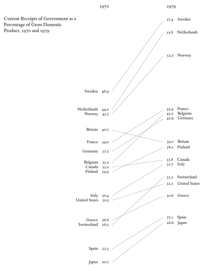
In his 1983 book The Visual Display of Quantitative Information, Tufte displayed a new type of data graphic.
Tufte, Edward. The Visual Display of Quantitative Information.
Cheshire, Connecticut: Graphics Press; 1983; p. 158
As Tufte notes in his book, this type of chart is useful for seeing:
- the hierarchy of the countries in both 1970 and 1979 [the order of the countries]
- the specific numbers associated with each country in each of those years [the data value next to their names]
- how each country’s numbers changed over time [each country’s slope]
- how each country’s rate of change compares to the other countries’ rates of change [the slopes compared with one another]
- any notable deviations in the general trend (notice Britain in the above example) [aberrant slopes]
This chart does this in a remarkably minimalist way. There’s absolutely zero non-data ink.
(One important thing to note is that this chart shows the same types of data on the left and right sides, using the same units of measurement. I’ll come back to this later.)
So, anyway, Professor Tufte made this new kind of graph. Unlike sparklines, though, it didn’t really get picked up. Anywhere.
My theory on this lack of response is three-fold:
- It didn't have a name. (He just referenced it as a "table-graphic" at the time.)
- It was a totally new concept. (Where sparklines are easily understood as "an axis-less line chart, scaled down (and kind of cute)", this "table-graphic" is something new.)
- It's a
littlegood deal more complicated to draw. (More on that at the end.)
A Super-Close Zoom-In On A Line Chart
A quick aside: The best way I’ve found to describe these table-graphics is this: It’s like a super-close zoom-in on a line chart, with a little extra labeling.
Imagine you have a line chart, showing the change in European countries’ population over time. Each country has a line, zigzagging from January (on the left) to December (on the right). Each country has 12 points across the chart. The lines zigzag up and down across the chart. Now, let’s say you zoomed in to just the June-July segment of the chart, and you labeled the left and right sides of each country’s June-July lines (with the country’s name, and the specific number at each data point).
That’s it. Fundamentally, that’s all a table-graphic is.
Hierarchical Table-Graphics In The Wild
Where sparklines found their way into products at Google (Google Charts and Google Finance) and Microsoft (grrr), and even saw some action from a pre-jQuery John Resig (jspark.js), this table-graphic thing saw essentially zero uptake.
At-present, Googling for “tufte “table-graphic”” yields a whopping 83 results, most of which have nothing to do with this technique.
Actually, since Tufte’s 1983 book, I’ve found three non-Tuftian examples (total). And even they don’t really do what Tufte laid out with his initial idea.
Let’s look at each of them.
Ben Fry’s Baseball Chart
The first we’ll look at came from Processing developer / data visualization designer Ben Fry, who developed a chart showing baseball team performance vs. total team spending:

A version of this graphic was included in his 2008 book Visualizing Data, but I believe he shared it online before then.
Anyway, you can see each major-league baseball team on the left, with their win/loss ratio on the left and their annual budget on the right. Between them is a sloped line showing how their ordering in each column compares. Lines angled up (red) suggest a team that is spending more than their win ratio suggests they should be, where blue lines suggest the team’s getting a good value for their dollars. The steeper the blue line, the more wins-per-dollar.
There are two key distinctions between Tufte’s chart and Fry’s chart.
First: Fry’s baseball chart is really just comparing order, not scale. The top-most item on the left is laid out with the same vertical position as the top-most item on the right, and so on down the list.
Second: Fry’s is comparing two different variables: win ratio and team budget. Tufte’s looks at a single variable, over time. (To be fair, Fry’s does show the change over time, but only in a dynamic, online version, where the orders change over time as the season progresses. The static image above doesn’t concern itself with change-over-time.)
If you want to get technical, Fry’s chart is essentially a “forced-rank parallel coordinates plot” with just two metrics.
Another difference I should note: This type of forced-rank chart doesn’t have any obvious allowance for ties. That is, if two items on the chart have the same datum value (as is the case in 11 of the 30 teams above), the designer (or the algorithm, if the process is automated) has to choose one item to place above the other. (For example, see the Reds and the Braves, at positions 6 and 7 on the left of the chart.) In Fry’s case, he uses the team with the lower salary as the “winner” of the tie. But this isn’t obvious to the reader.
In Visualizing Data, Fry touches on the “forcing a rank” question (p. 118), noting that at the end of the day, he wants a ranked list, so a scatterplot using the X and Y axes is less effective of a technique (as the main point with a scatterplot is simply to display a correlation, not to order the items). I’m not convinced, but I am glad he was intentional about it. I also suspect that — because the list is generated algorithmically — it was easier to do it and avoid label collisions this way.
Nevertheless, I do think it’s a good visualization.
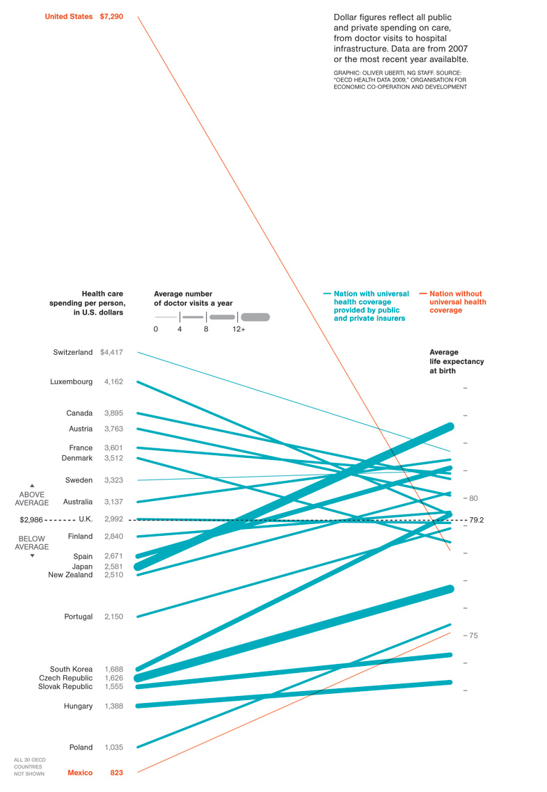
The National Geographic Magazine Life-Expectancy Chart
In 2009, Oliver Uberti at National Geographic Magazine released a chart showing the average life expectancy at birth of citizens of different countries, comparing that with what each nation spends on health care per person:
 http://blogs.ngm.com/blog_central/2009/12/the-cost-of-care.html
Like Fry’s chart, Uberti’s chart uses two different variables. Unlike Fry’s chart, Uberti’s does use different scales. While that resolves the issue I noted about having to force-rank identical datapoints, it introduces a new issue: dual-scaled axes.
By selecting the two scales used, the designer of the graph — whether intentionally or not — is introducing meaning where there might not actually be any.
For example, should the right-side data points have been spread out so that the highest and lowest points were as high and low as the Switzerland and Mexico labels (the highest and lowest figures, apart from the US) on the left? Should the scale been adjusted so that the Switzerland and/or Mexico lines ran horizontally? Each of those options would have affected the layout of the chart. I’m not saying that Uberti should have done that — just that a designer needs to tread very carefully when using two different scales on the same axis.
(Stephen Few discusses this concept of dual-scaled axes — although he isn’t talking about this chart type — in his March 2008 newsletter.)
A few bloggers (Jon Peltier, for example) criticized the NatGeo chart, noting that, like the Fry chart above, it was an Inselberg-style parallel-coordinates plot, and that a better option would be a scatter plot. (I disagree that it’s really a parallel-coordinates plot, as parallel-coordinate plots usually compress everything into a unified vertical axis height, so the scale is somewhat pre-determined. I digress.)
In a great response on the NatGeo blog, Uberti then re-drew the data in a scatter plot:

Uberti also gave some good reasons for drawing the graph the way he did originally, with his first point being that “many people have difficulty reading scatter plots. When we produce graphics for our magazine, we consider a wide audience, many of whose members are not versed in visualization techniques. For most people, it’s considerably easier to understand an upward or downward line than relative spatial positioning.”
I agree with him on that. Scatterplots reveal more data, and they reveal the relationships better (and Uberti’s scatterplot is really good, apart from a few quibbles I have about his legend placement). But scatterplots can be tricky to parse, especially for layfolk.
Note, for example, that in the scatter plot, it’s hard at first to see the cluster of bubbles in the bottom-left corner of the chart, and the eye’s initial “read” of the chart is that a best-fit line would run along that top-left-to-bottom-right string of bubbles from Japan to Luxembourg. In reality, though, that line would be absolutely wrong, and the best-fit would run from the bottom-left to the upper-right.
Also, the entire point of the chart is to show the US’s deviant spending pattern, but in the scatter plot, the eye’s activity centers around that same cluster of bubbles, and the US’s bubble on the far right is lost.
The “Above average spending / Below average life expectancy” labels on the quadrants are really helpful, but, again, it reinforces Uberti’s point, that scatter plots are tricky to read. Should those labels really be necessary? Without them, would someone be able to glance at the scatter chart and “get it”?
For quick scanning, the original chart really does showcase the extraordinary amount the US spends on healthcare relative to other countries. And that’s the benefit of these table-graphics: Slopes are easy to read.
Speed Per Dollar
Back in July of 2007 (I know: we’re going back in time a bit, but this chart diverges even more from Tufte’s than the others, and I wanted to build up to it), a designer at online driving magazine WindingRoad.com developed the “Speed per Dollar” index:
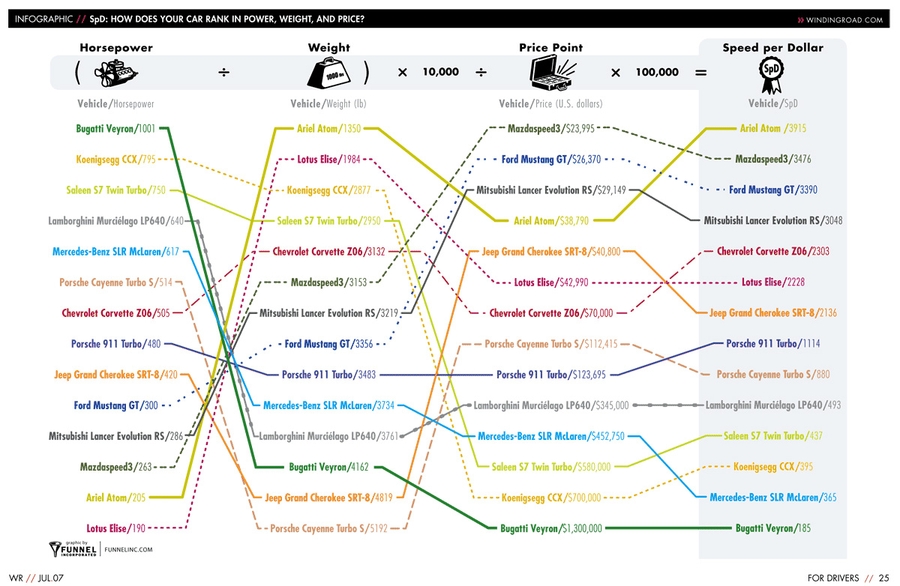
Again, what we have is, essentially, an Inselberg-style parallel-coordinates plot, with a Fry-style forced-rank. In this case, though, each step of the progression leads us through the math, to the conclusion at the right-side of the chart: dollar-for-dollar, your best bet is the Ariel Atom.

Homina homina homina.
Anyway, this chart uses slopes to carry meaning, hence its inclusion here, but I think it’s different enough from the table-chart Tufte developed in 1983 that it isn’t quite in the same family.
Dave Nash, a “kindly contributor” at Tufte’s forum then refined the chart, making aspects of it clearer and more Tuftian (original graphic on top, Nash’s on bottom):

(I like how the original included the math at the top of the chart, showing how the SPD value was derived, and I like how it highlights the final column, drawing the eye to the conclusions, but I do think Nash’s shows the data better.)
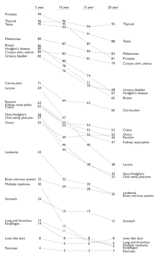
Cancer Survival Rates
We’ll close with the last example of these table-charts I’ve found (and I’ve looked for others; if you know any others, let me know: (charlie@pearbudget.com).
This one’s from Tufte himself. It shows cancer survival rates over 5-, 10-, 15-, and 20-year periods.
 http://www.edwardtufte.com/bboard/q-and-a-fetch-msg?msg_id=0000Jr
Actually, the chart above is a refinement of a Tufte original (2002), done (again) by Kindly Contributor Dave Nash (2003, 2006).
Owing it to being a creation of the man himself, this is most in-line with the table-chart I showed at the very top, from 1983. We can clearly see each item’s standings on the chart, from one quinquennium to the next. In fact, this rendition of the data is a good illustration of my earlier simplification, that these table-charts are, essentially, minimalist versions of line charts with intra-line labels.
Tufte Names His Creation
Although it’s possible that Tufte has used this term in his workshops, the first occasion I can find of the “table-chart” having an actual name is this post from Tufte’s forums on June 1st, 2011. The name he gives the table-chart: “Slopegraphs”.
I suspect that we’ll see more slopegraphs in the wild, simply because people will now have something they can use to refer to the table-chart besides “that slopey thing Tufte had in Visual Design.”
But there’s still a technical problem: How do you make these damn things?
Making Slopegraphs
At the moment, both of the canonical slopegraphs were made by hand, in Adobe Illustrator. A few people have made initial efforts at software that aids in creating slopegraphs. It’s hard, though. If the labels are too close together, they collide, making the chart less legible. A well-done piece of software, then, is going to include collision-detection and account for overlapping labels in some regard.
Here are a few software tools that are currently being developed:
- Dr. David Ruau has developed a working version of slopegraphs in R
- Alex Kerin, slopegraphs in Tableau
- Coy Yonce, slopegraphs in Crystal Reports and slopegraphs in Crystal Reports Enterprise
- I started developing a slopegraphs in Javascript / Canvas version, but probably won’t continue it, and will try to use the Google Charts’ API if I try again. The “jaggies” on the lines were too rough for me. (I only include it here in case anyone is interested in running with what I’ve stubbed out.)
In each case, if you use the chart-making software to generate a slopegraph, attribute the software creator.
With this many people working on software implementations of slopegraphs, I expect to see a large uptick in slopegraphs in the next few months and years. But … when should people use slopegraphs?
When to Use Slopegraphs
In Tufte’s June 1st post, he sums up the use of slopegraphs well: “Slopegraphs compare changes over time for a list of nouns located on an ordinal or interval scale.”
Basically: Any time you’d use a line chart to show a progression of univariate data among multiple actors over time, you might have a good candidate for a slopegraph. There might be other occasions where it would work as well. Note that strictly by Tufte’s June 1st definition, none of the examples I gave (Baseball, Life Expectancy, Speed-per-Dollar) count as slopegraphs.
But some situations clearly would benefit from using a slopegraph, and I think Tufte’s definition is a good one until more examples come along and expand it or confirm it.
An example of a good slopegraph candidate: In my personal finance webapp PearBudget, we’ve relied far more on tables than on charts. (In fact, the only chart we include is a “sparkbar” under each category’s name, showing the amount of money available in the current month.) We’ve avoided charts in general (and pie charts in particular, unlike every other personal finance webapp), but I’m considering adding a visual means of comparing spending across years — how did my spending on different categories this June compare with my spending on those categories in June of 2010? Did they all go up? Did any go down? Which ones changed the most? This would be a great situation in which to use a slopegraph. (If I do implement them, I’ll be sure to post a follow-up with screenshots and an explanation of how I got them to work.)
Slopegraph Best Practices
Because slopegraphs don’t have a lot of uses in place, best practices will have to emerge over time. For now, though …
- Be clear — first to yourself, then to your reader — whether your numbers are displaying the items in order or whether they’re on an actual scale.
- Note how on Tufte’s original chart, Belgium and Canada have the same left-side value (35.2), but are placed at different vertical positions (ordinal), but how the cancer survival chart positions Kidney and Colon cancers — both with the same left-side value (62) — at the same vertical point.
- An important consideration: is the primary purpose of the chart to show the relative rate of change for each item over time? The absolute values for each item? Both pieces of information? Knowing this will help you make decisions about scaling and labeling.
- If the datapoints or labels are bunching up, expand the vertical scale as necessary.
- Left-align the names of the items on both the left-hand and right-hand axes, to make vertical scanning of the items’ names easier.
- Include both the names of the items and their values on both the left-hand and right-hand axes.
- Use a thin, light gray line to connect the data. A too-heavy line is unnecessary and will make the chart harder to read.
- But: When a chart features multiple slope intersections (like the baseball or speed-per-dollar charts above), judicious use of color can avoid what Ben Fry describes as the "pile of sticks" phenomenon (Visualizing Data, 121).
- A table (with more statistical detail) might be a good complement to use alongside the slopegraph. As Tufte notes: “The data table and the slopegraph are colleagues in explanation not competitors. One display can serve some but not all functions.”
- Defer to current best practices outlined by Tufte, Stephen Few, and others, including maximizing data-to-ink ratios, minimizing chartjunk, and so on.
- The 45° rule doesn't apply to slopegraphs, obviously.
- For a refresher on other data visualization best practices, the Tufte in Twenty PDF by Pamela Brown and Russ Acker is particularly good. Other summarized resources are listed at the Association of American Universities Data Exchange site.
Wrapping Up
That’s about it for now. I’ll try to update this post as more examples surface.
I would like to thank Matt Frost, David Ruau, and Edward Tufte for reading drafts of this article, and to the commenters on the edwardtufte.com forums for their enlightening posts over the years.
If you see a slopegraph out in the wild, or if you have any feedback on this post, shoot me a note on Twitter (@charliepark) or by e-mail (charlie@pearbudget.com). I look forward to learning more from you.
Now that you’ve made it through this post, you’ll probably want to check out the follow-up, A Slopegraph Update. There, we cover things like “bumps charts,” parallel coordinate plots, ladder charts, and we see a whole raft of examples of slopegraphs in the wild. Some from before the post you just read, some inspired by it. It’s here: http://charliepark.org/a-slopegraph-update.