Beautiful Buttons for Twitter Bootstrappers
Six months ago, a small team at Twitter (Mark and Jacob) made their front-end design framework — something they called “Twitter Bootstrap” — public. It’s a really nice piece of work, and I’ve been a big fan from day one.
One issue I was having, though, was that I didn’t like the button colors. I mean, yeah, the blue was nice, but button colors should be a bit more flexible. And with the new Bootstrap 2.0, you can kind of set up some custom colors. But, even with the customizations, I thought it could be a bit more dynamic.
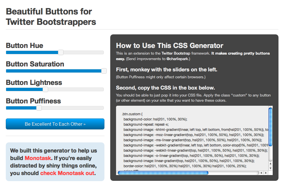
So using jQuery and — of course — Twitter Bootstrap, I built a tool for building … Beautiful Buttons for Twitter Bootstrappers.
I’m actually really happy with how it turned out. It lets you use sliders to adjust the hue, the saturation, the lightness, and, um, the “puffiness” of your buttons. And it generates customized CSS for you to select, copy, and paste into your project. It works with Twitter Bootstrap 2.0 and with all earlier versions — I actually built it back on Twitter Bootstrap 1.1.1. (The only thing I’m not 100% thrilled with is how as you “puffify” the buttons, the colors sometimes desaturate. Also, I don’t think all of those browser-specific prefixes are necessary, but I figured I’d leave them in for now. If you have suggestions, as always, I’m open.)
I’m not sure why I didn’t announce this or make it available before now. I first built it back in the fall. I think I was waiting until Monotask was a leetle closer to being publicly shareable. But with the Twitter Bootstrap team’s announcement of version 2.0, I figured I’d go ahead and roll this out. Here you go, kids. Have fun.
I hope you enjoy it, and that it makes tons of pretty buttons for you. And — although it’s not quite public, if you sign up to be notified when we launch Monotask, we’ll let you know when it’s available for checking out, and you can see how I used these buttons in the app.
